From Camera to Color : A Creative Partnership
From Camera to Color : A Creative Partnership
DP Sam Coombes and Colorist James Galbraith have been collaborating on projects for years. With Sam based in Canada and James in Spain, Louper has played an important role in building and maintaining their creative connection.
How did you first meet one another?
James Galbraith: when I first started as a freelance colorist, I did a job for the ACE Awards with Matt from Joe Media, and sure enough Sam Coombes was the DP on that job. We got on really well, and we've been collaborating ever since. Our style is very similar, we’re just two individuals that always strive to get the best out of everything.
Sam Coombes: It was quite a serendipitous meeting, because he had moved to the UK as I'd moved to Canada. So it was almost like a bit of a creative exchange of talent and countries. Since then, James and I have pretty much worked on every project together. This industry is built on relationships. I feel like those relationships go an extremely long way and having somebody that you can rely on to get you out of a bit of a jam, is worth its weight in gold. My relationship with James is exactly that - we just have a shorthand.
Let's look at some of the work that you've done together. Can you tell me about the Unjust Stop project?
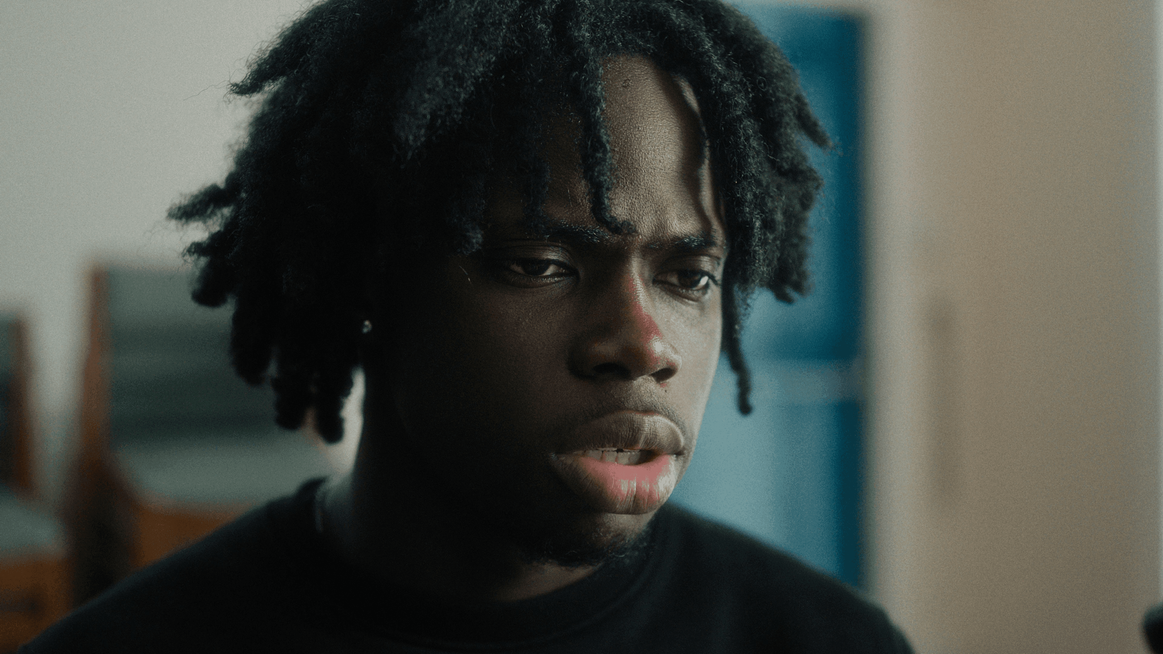
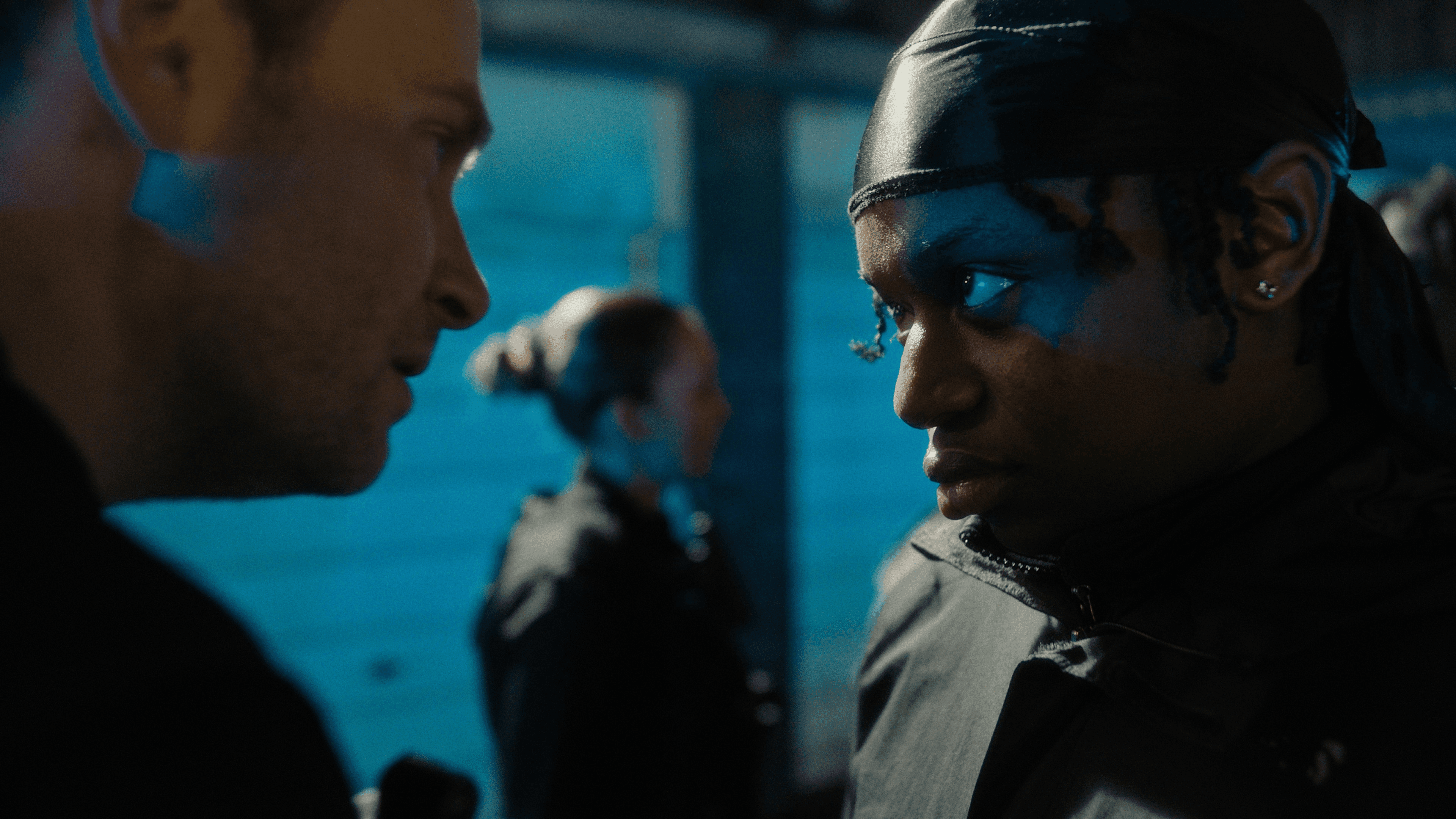
SC: Jack Chapman was the director of Unjust Stop, which was a short narrative piece, funded by the Avon and Somerset Police in Bristol, because there was a lot of racial profiling going on, specifically in the southwest of England, where young groups of black and ethnic minority children were being targeted by the police. At the Bristol Old Vic there’s a group called the Young SixSix, a group of young, incredibly talented directors, writers, actors who were given the opportunity to spearhead this entire production. They came up with the idea and myself and Jack came on obviously as industry professionals to execute it.
I thought it was so well crafted - you really felt that tension and anxiety in both the scene with the police, and the counseling scene. James, how did you approach the color for this piece?
JG: For this one, we wanted something modern, but with filmic roots, so nice, deep contrast but nothing that leaned into otherworldly. They wanted it grounded in reality but with a very distinct look. So we just went with a classic film print and dialed in some nice textures. And then working with some of the mixed media, body cam, and iPhone stuff, we just wanted to make sure that wasn't messed with too much and still felt like the media that it's supposed to be. So that was just about making sure that it felt seamless as we cut to and from the live action with the mixed media. And as you said, I think there is still that mood of the interior scene as well. I think they just nailed things in camera. They nailed the look in camera and it just worked.
And can you tell me about the two poetic pieces that came out of this project?
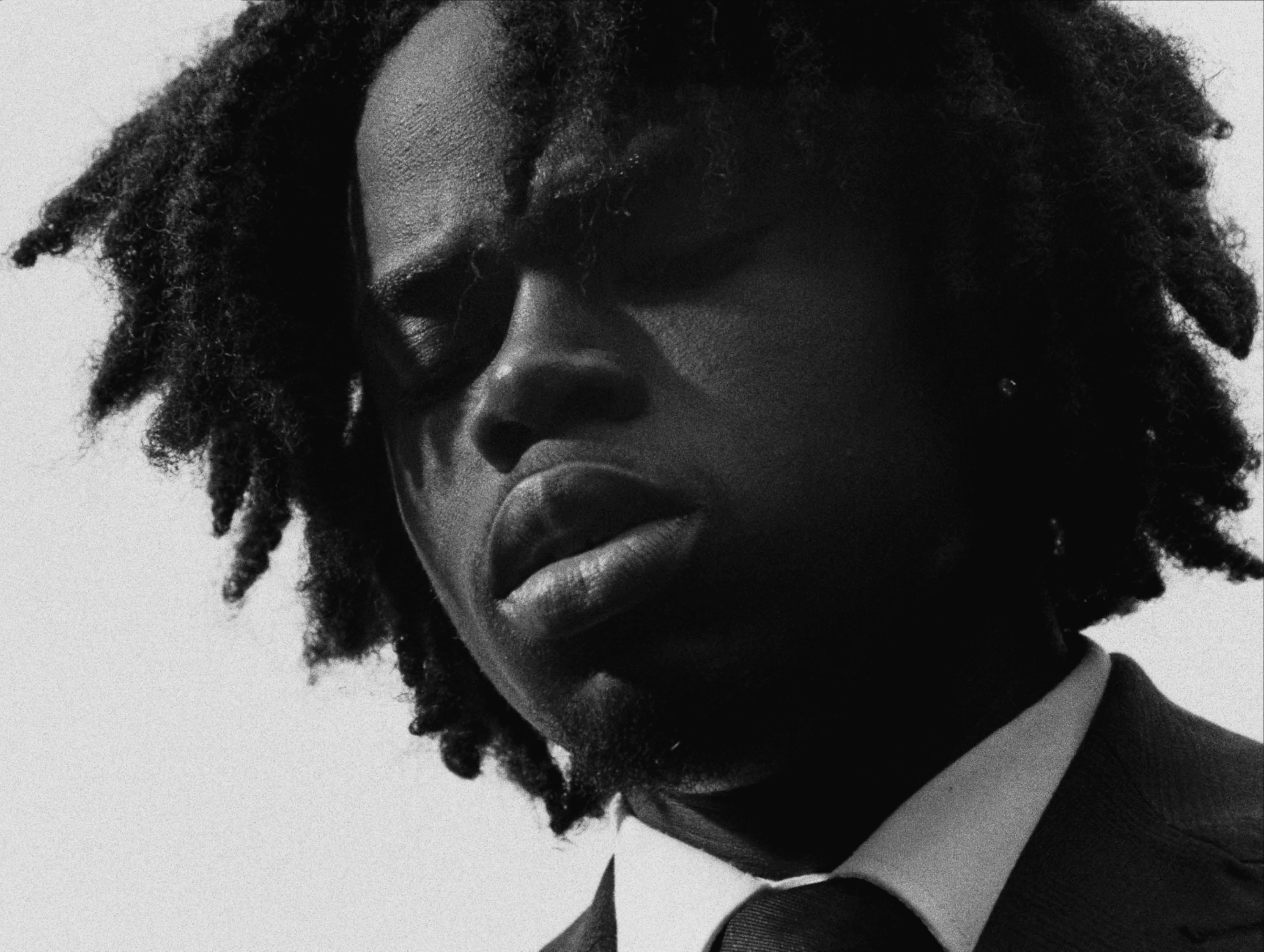
SC: Off the back of that film, Sweet Sixteen and Sus Law were born. There was a small amount of budget left over and one of the young people, Khadijah, approached us with a monologue that she'd written. It was so impactful and so poignant, we decided to turn it into a one-shot film. And then that inspired David, who stepped up and wrote a piece about a friend of his who had lost his brother. The subject matter was quite hard-hitting and it was quite an emotional journey but I feel like the process of working with those young people and working with Jack and James was just one of the most rewarding things I've ever done.
How do you approach shooting for black and white versus a project that is going to be in color?
SC: I almost find shooting in black and white easier because you don't have the clashing colors or color cast to contend with. In a way it's a lot more forgiving, but then obviously what you're paying attention to is the contrast levels and the texture. I went and took some test shots in a very similar lighting setup with the camera and the lens package that I was going to use and then I gave it to James who developed a look that I reviewed via Louper. On the camera package that I was shooting on, you can't include the film grain and texture, so he removed that and just gave me the contrast and the levels that we'd dialed in on the look and turned that into an in-camera look, which I use for the two pieces to keep them consistent.
JG: So because Sam and Jack had shot with a monitoring LUT, when they came back to me it was such a seamless process. I think there is a lot of benefit to bringing on a colorist in pre-production to develop the look.
If clients are able to bring on a colorist in pre-production, I genuinely think that everyone is a lot happier with the end result. When your clients are used to seeing a LUT that's close to the final look right through the entire pipeline, even from the early stage edits, it just means everyone's on the same page. I think it's my responsibility to educate and inform people that might not think that it's important to bring a colorist in early. Myself, Jack, Sam - anyone who I've done that with - we've all seen the benefit immediately.
Let’s look at your recent collaboration for the Northern Alberta Institute for Technology.
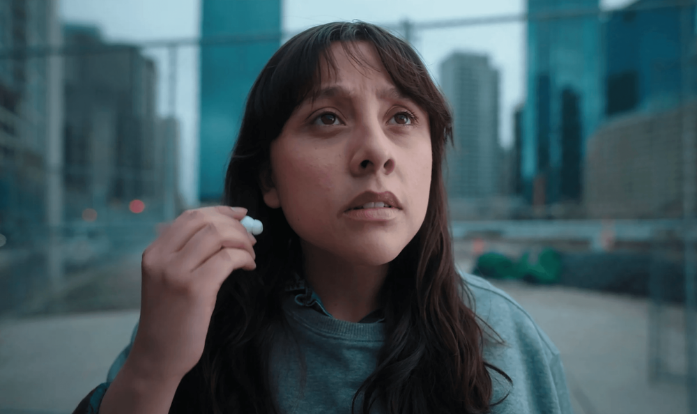
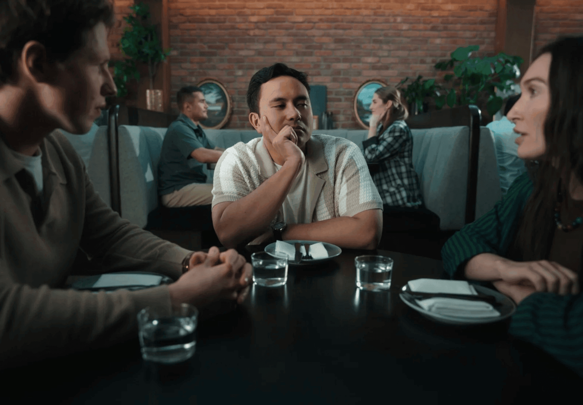
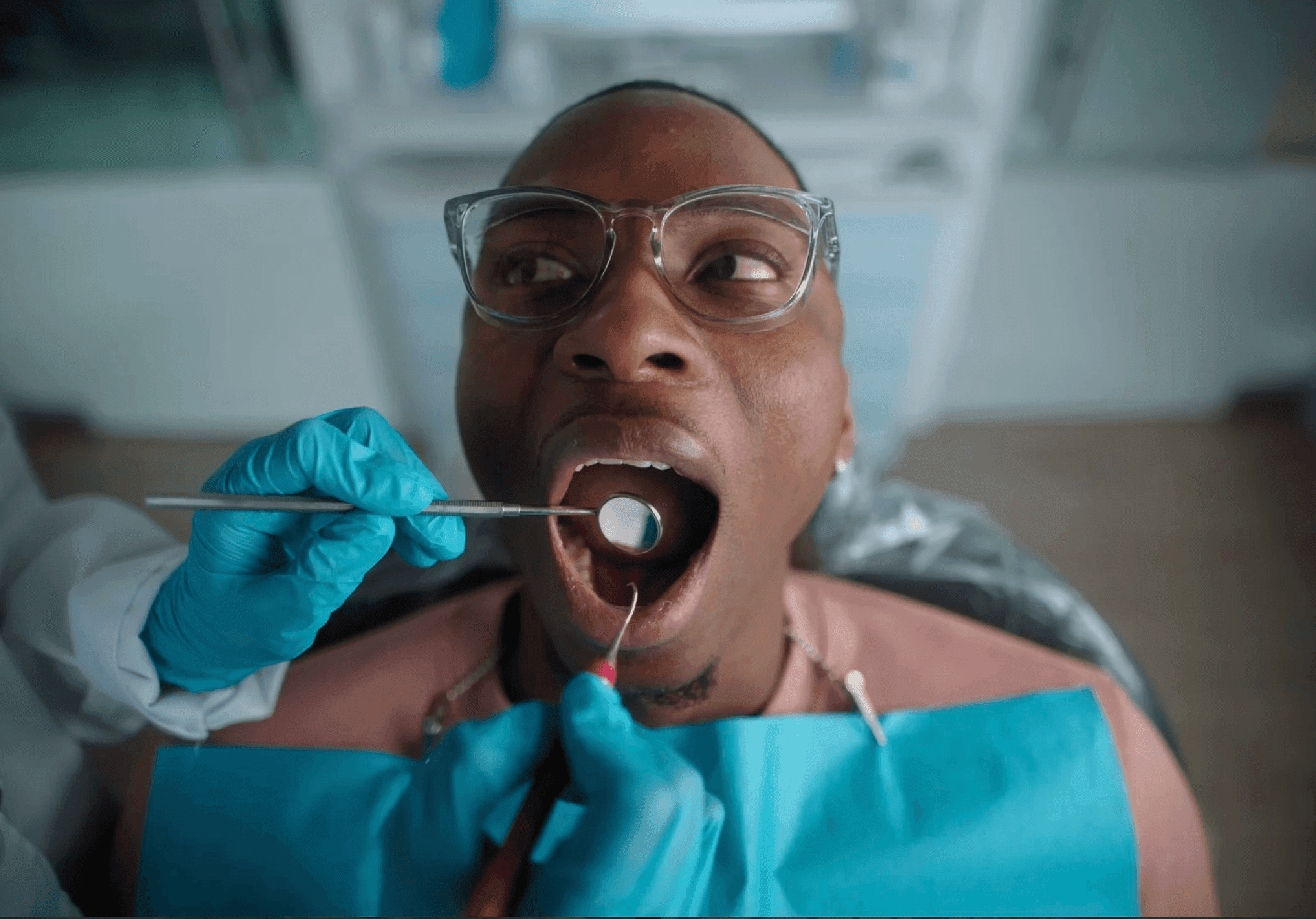
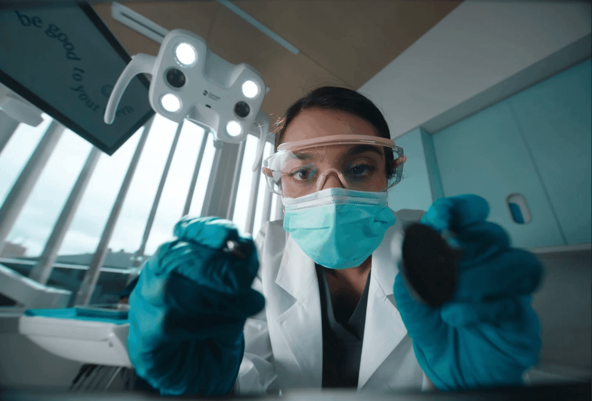
SC: So the NAIT project came about through an agency called ZGM, and the directors that came on board are a directing duo called Strangebrew Creative. NAIT want to attract more students into each of the individual career paths that that were outlined in the spots. And the idea was that the person hiring them is present in the spot and the student is reacting to them in kind of a funny way: instead of saying what you think they should be saying, the word is replaced with "NAIT". So it’s just a short and sweet, playful way of highlighting the different courses that you can take at NAIT.
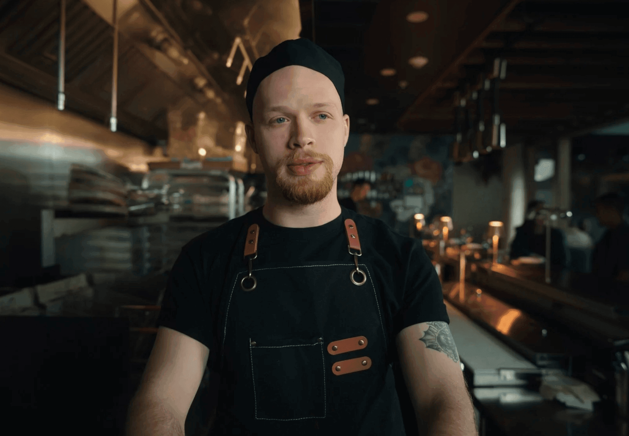
SC: The location itself almost acted as a reference to the potential employer. For the chef in the kitchen, we needed to see the kitchen. It couldn't just be a chef close up, with chef whites. I don't feel like it would have clicked as quickly with the viewer. So finding that right location and having enough depth within the image for it to be interesting, but also seeing more of the location and having the location present within the frame was a challenge and that's why after testing multiple cameras and lenses we decided to go with the LF and the Panavision Primos.
I absolutely love them. I feel like the image that they give is just extraordinary. The way that they capture the highlight roll-off and the color accuracy, which is extremely important for me. Every single lens in the set matches. There's absolutely nothing left to chance. They're just beautiful and gave me the depth that I wanted from the full frame sensor. It was sharp but it still had a softness to the image, which I like. And then I used a black satin quarter strength in front of the glass just to add a bit more softness to the image. I just feel like it's such a big frame, everything feels large and it still has that beautiful separation, that beautiful roll-off, and a nice inherent softness, but if you zoom into the images they're extremely sharp. It just ticked every box and I felt like it was the right choice for this project.
Absolutely. It felt premium and unusual as well - you were very close to the subject and yet you felt so much of the world around them.
SC: Yeah, the majority of these spots were actually shot on the 27mm which is one of my favorite lenses and focal lengths. Having the taller frame from the LF sensor and using that wider lens closer to the subject allows more freedom of cropping in post without losing too much of the image, as a lot of these projects now are moving further into social media and multiple aspect ratios.
We didn't want to go too wide because it starts to distort people's faces, and I didn't want to detract from the humor of the spots by forcing the humor on the viewer with abstract faces and warped, distorted frames. So the 27mm was pretty much bang on the money in terms of the frame size and the depth that I wanted to get. I also didn't want to go 50mm, 75mm, because I feel like that goes too far down the other way and kind of takes the fun out of it. So I was trying to find that balance of it being fun but not silly.
And James, how were you briefed for the grade?
JG: Sam and the directing duo, Strangebrew, did location scouts and then sent through a bunch of references for me to go off. They wanted something that was a bit surreal but very grounded in that commercial world. Strong contrast but soft, and making sure that colors were popping where they needed to, with all the focus on the character who's in the frame. I did a bit more keying to separate skin tone from background, which was something this project leaned into.
They're all shot in separate locations that changed what you're seeing, but my process didn't change whatsoever. There was still a core look on a group level for everything and then it was just dialing in the environment that they're in and focusing on the skin tones. And I think a big thing was our art department and location and talent, and then obviously Sam and the rest of the crew just nailed the look. As soon as I saw the log images, I was just like: yeah, this is gonna be the best, it just looks so nice. I don't know what Sam did but the skin tones were just perfect. He makes my work look really good.
Can you talk about collaborating on Louper for this project?
JG: I think one of my favorite parts about this job is just collaborating with other creative people. And when you're able to facilitate a collaborative session remotely, that's a pretty crazy thing because you can bring in talent from all over. The remote session that we had for these NAIT projects - one of the directors was dialed in from Mexico on holiday, myself in Spain, two guys in Canada - all still being able to collaborate and work together. It was just a fun session. We were all happy with where we got to with the look in the first hour of the session. And then we just had fun, trying different things out.
SC: Having the ability to all be on the same page and just to review instantaneously, it takes us less than five minutes to scrub through, make some notes, I feel like it's freed up a lot of time in our schedules, and it makes working on other projects simultaneously possible. I just don't see how we would have been able to achieve the look and deliver it to the client on time without having access to Louper. It was absolutely integral to our post-production workflow. And you know, it's always nice to see people when you're working. So it's nice to see James and nice to see Nick when he's relaxing in Cabos with a Piña Colada.
And how has Louper transformed your workflow in general?
JG: When I first started freelancing, I would connect just through Zoom with clients, talk about the grade, do a pass, and then upload that pass to Frame. I did that for a while, and you start to realize this workflow just doesn’t work. It ended up pass after pass, misinterpreting comments and amendments and stuff like that. And then I gave Louper a try. I went from doing like three, four passes on most projects to doing one solid pass, maybe two with the second one just final tweaks, because I'm able to collaborate with directors, DP’s, producers, to just dial in the look all together. It's the cornerstone of my workflow now.
SC: I feel like as much as it is a tool for the work that we do in post-production and even in pre-production, it's also a social platform. I look forward to my sessions with James on Louper. We often jump on like an hour before just to catch up. Having these Louper sessions: it's in everyone's calendar, everybody looks forward to it, and it gives me the opportunity to still stay in touch with my friends that are in all corners of the globe.
JG: I've only met Sam once in person, he came through to Aberdeen for a couple beers and that's about it. Other than that it's it's been all remote which is just insane. I don't see this collaboration slowing down anytime soon and just can't wait for the next project that Sam is gonna shoot, because I know he's just gonna nail the brief, nail whatever he's working on. I get so giddy when he tells me there's a new project on the horizon and we get to work together again. It's the best.
Sam Coombes is a Director of Photography based in Canada.
Sam is represented by Joe Media Group. You can view his portfolio, including the NAIT campaign, here.
James Galbraith is a freelance Colorist, based in Spain.
Check out his site to view the short films Unjust Stop, Sweet Sixteen and Sus Law.
James works with clients across the globe, running his remote live sessions on Louper.
Visit our Docs site to view detailed setup guides for DaVinci Resolve. James uses a conversion LUT in his workflow, find out how to add a LUT to LDE here.
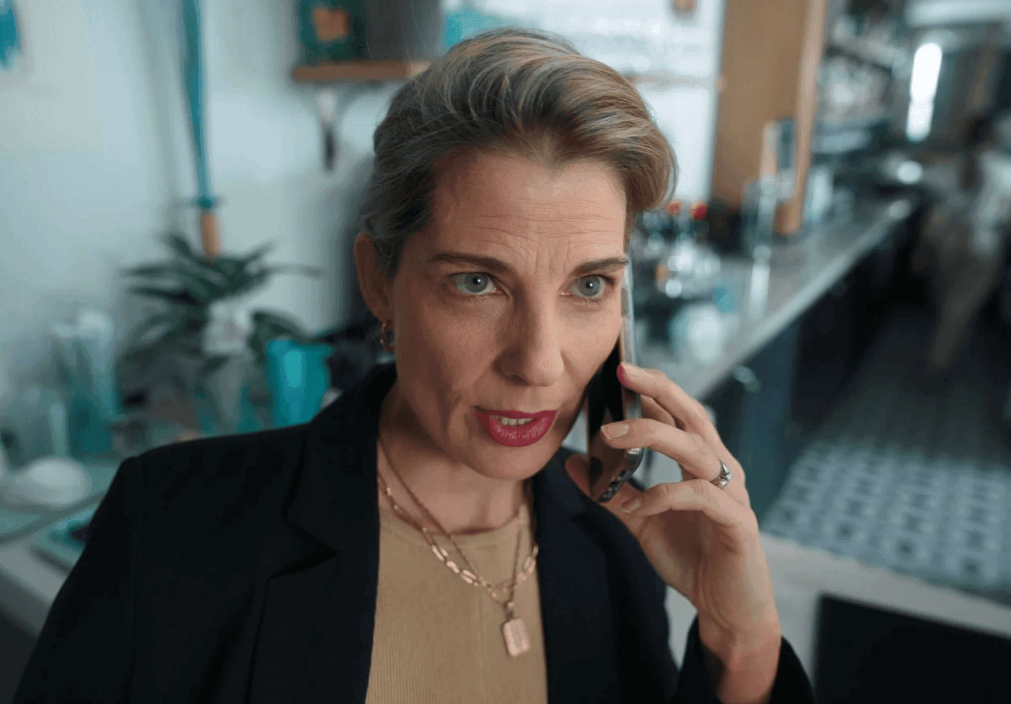
Still Images from:
Campaign spots for NAIT: Chef, Business, Trades and Dentist. Short films Unjust Stop and Sweet Sixteen.
Use Louper to stream and collaborate on live shoots, edit sessions, vfx reviews and more - securely and in seriously high quality.
