Inside the Color Suite: Calvin Bellas on Craft, Collaboration and Clarity
Inside the Color Suite: Calvin Bellas on Craft, Collaboration and Clarity
From Krispy Kreme and Google campaigns to Travis Scott’s Kick Out, colorist Calvin Bellas discusses his creative process and why clear communication is key when running live color sessions.
Calvin, can you tell us a bit about your current setup?
I’m based in New York City, and right now I'm pretty hybrid. I work with Royal Muster, so they bring in projects and I go into our office when we have attended sessions. I do have a studio at home as well, which has been awesome, so for private jobs I can do attended sessions at home or I can do remote sessions, depending on where my clients are. I feel like clients, creative directors, producers, they’re always on set or in audio sessions, or they're wrapping up an edit. So the use of remote sessions has been key, because it helps things move more smoothly and it makes people more available. They would much rather hop on a live session and then jump back to set or onto the next production that they're doing.
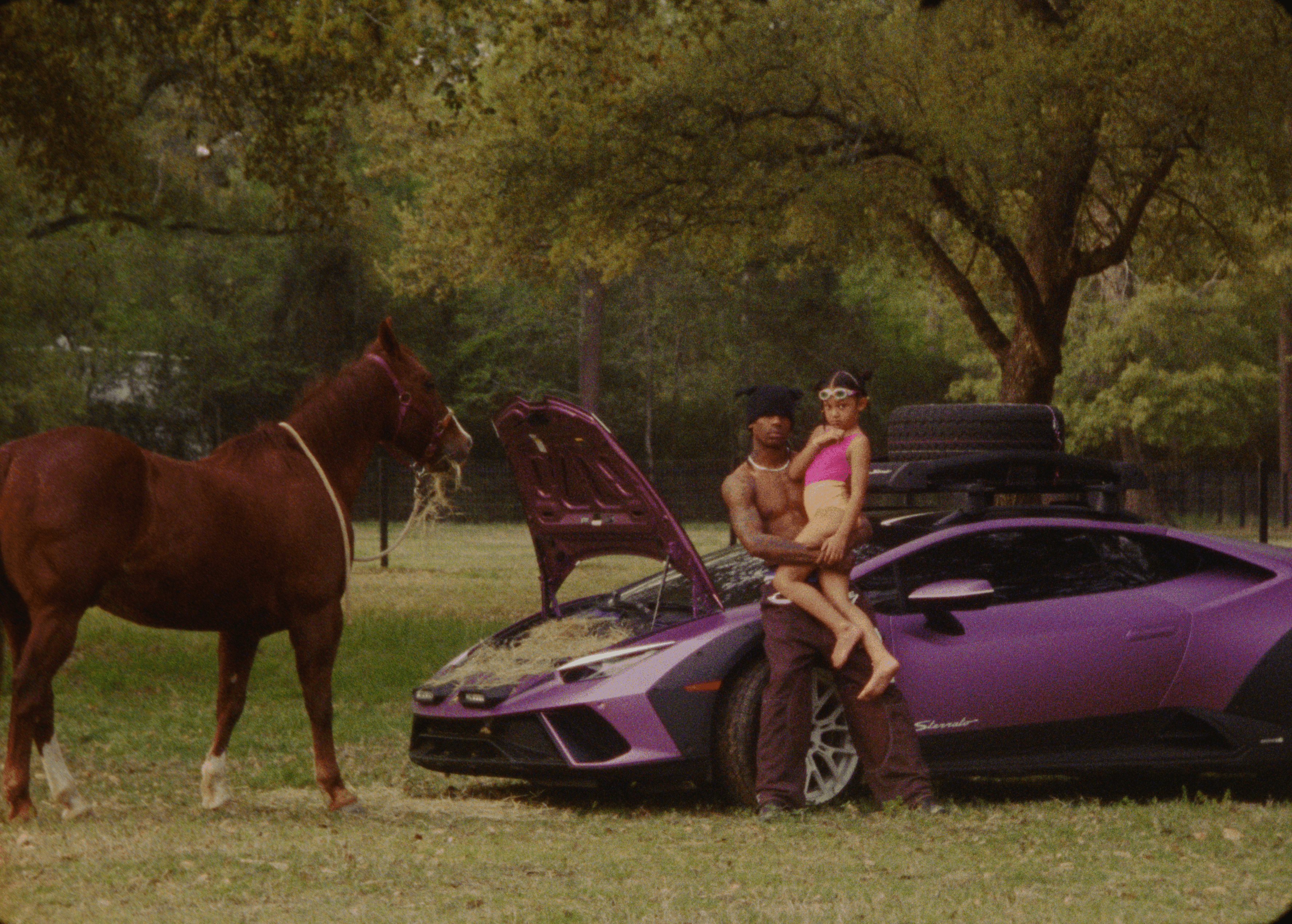
Still from Travis Scott's 'Kick Out'
Let’s look at Travis Scott ‘Kick Off’ - that must have been such a fun project!
Yeah, that was a job I did at Royal Muster, we had a lot of fun with it. When a job comes in, as a colorist, you look over the material and you ask the client if there's any references, what are we looking for? And Travis really loves the color brown and implementing brown as much as possible into the material. And then, of course, when I saw the Lamborghini, I was like, “Okay, that's gonna be the focal piece for sure!” And with the sunsets that they captured, it was really something that I was able to play off of. In my projects, if I can find motifs that can connect throughout the piece, I really like honing in on that. So with that color, even the shot of the fish on the hook, I was really trying to push that purple in there for sure.
When I saw the Lamborghini, I was like, “that's gonna be the focal piece for sure!” In my projects, if I can find motifs that can connect throughout the piece, I really like honing in on that.
Travis Scott 'Kick Out'
I loved the image of Travis, his daughter and the horse eating hay out of the bonnet.
Yeah, we definitely went for a very family-oriented feeling: the family is filming Travis, his grandmother’s there… we really tried to lean into that as much as possible. I feel like with music videos there is a general storyline that we're trying to attach ourselves to, which I really like. There's a little bit more play, you can really experiment with some creative looks, and you're usually allowed to go a little bit darker with music videos. With commercial work, there's usually a product involved: be it a specific color for a brand or an actual product, there's always that one thing with commercials that we're trying to elevate and make sure it looks good. But with music videos, we want the whole story to be cohesive and the story is what we're trying to elevate the look on.
C4 Energy Drink 'Kevin Hart'
With regards to product color and production design, your job for C4 Energy drink is a good example of that. The brand colors were used really effectively in the different scenes.
The wardrobe and art department were so helpful. Because then as a colorist, instead of just focusing on the can, I could focus on the entire scene. And I feel like that helps elevate the product so much more. I like the idea of a commercial first giving an audience a feeling: you're pushing a vibe towards them, and then the call to action, like the C4 can popping up. And it's also Kevin Hart, he's a brand himself. I think the art department and the background, the papers and post-it notes and markers, all that really helps lend to the energy of the C4 can. So it's nice to be able to play off of those different things, instead of only one product. This cinematography was solid on the job, so it was really just balancing the different rooms. We had the gym, the locker room, the office, and then we had his home where he was vacuuming, we had his closet. We had a backlit scene with massive windows in the office, the client is always gonna wanna see as much as possible out of the window, but we were able to dial it in pretty well for sure. A lot of the team were in LA for this job, so Louper was essential when it came to collaborating.
The wardrobe and art department were so helpful. As a colorist, instead of just focusing on the can, I could focus on the entire scene. And that helps elevate the product so much more.
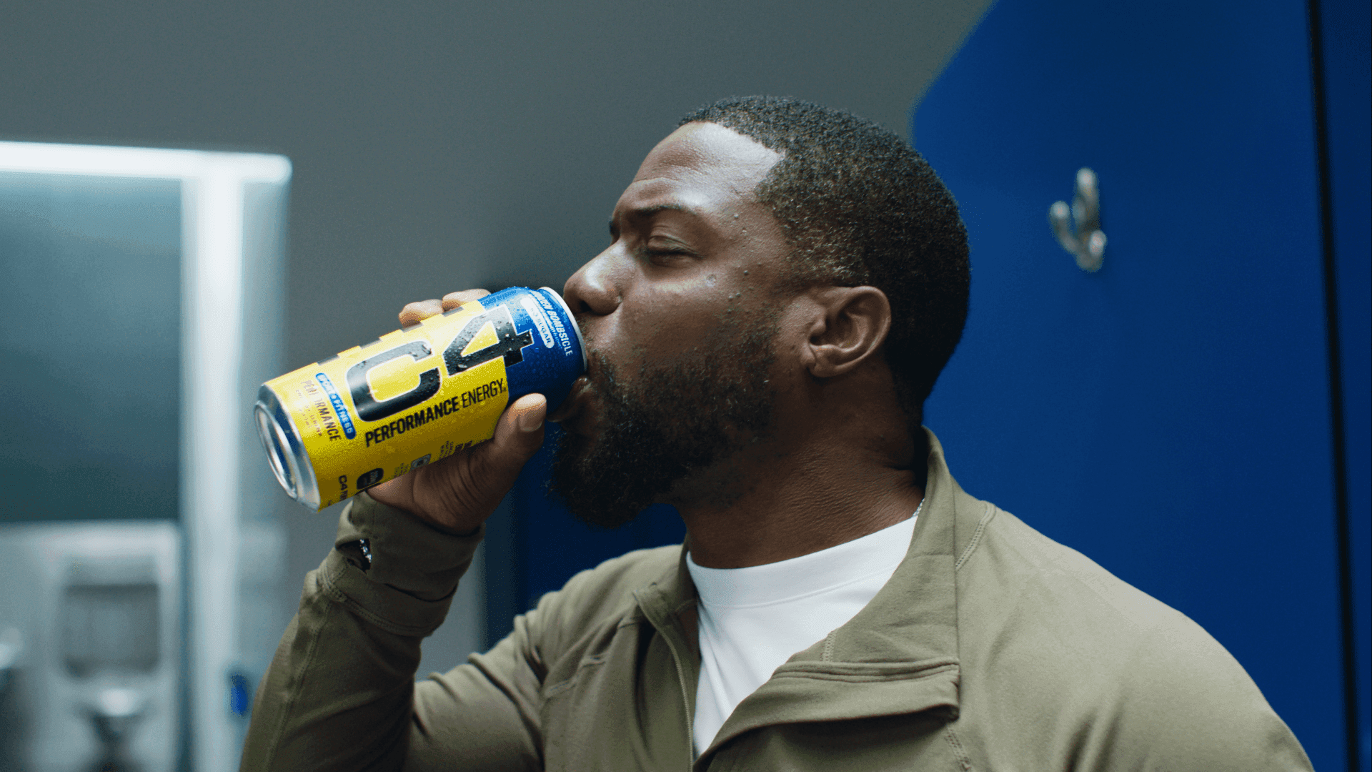
Still from C4 Energy Drink 'Kevin Hart'
Do you ever work completely asynchronously, just sending links and not having a live session at all?
Yeah, I do it depending on the project and depending on timing. Sometimes if we have a super busy day, it can be more efficient to at least get a pass out. But if I know a job's going to be difficult, I will always start with a look-set session live with Louper. That way we can see the feed together, and we can meet each other, because you're not always working with the same client.
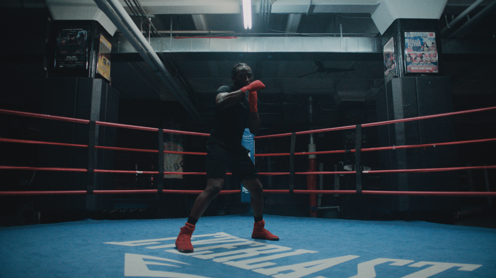
Still from Everlast 'Gonna Dance'
Yeah, that asynchronous workflow only works when you already have a relationship with the client.
Absolutely. For me, it's essential to meet my clients, for them to see my face and hear my voice. I'm not just this entity in the background pushing buttons and moving colors around. I'm Calvin, I'm a person, I want to build a rapport with them. I want to be able to hear their emotion and how they're involved in the project, whether it be a small commercial, a documentary, or a short film. Being able to see the person and talk to the person is just as invaluable as being able to see the work that we're collaborating on together. Sometimes you're talking to someone and you're multitasking and it’s like, we've gotten to know each other. We have a good rapport. We have a good vibe going. I know what you want and now I'm gonna step away and focus on that. And then we can hop back on and review things together.
For me, it's essential to meet my clients, for them to see my face and hear my voice. I'm not just this entity in the background pushing buttons and moving colors around. I'm Calvin, I'm a person, I want to build a rapport with them.
With the Everlast spot, it was edited by Jimmy Helton over at Final Cut in New York, and that team is super solid: from the producers, to assistant editors. The DP Bradley Credit was amazing on that too. He and I collaborate quite often, so we already have a shorthand, but then we also used Louper to get the agency and clients on the same page as well, because we want everyone to be happy.
Everlast 'Gonna Dance'
Bradley and I had a vision for the work that he shot on the Alexa 35, in the gym. And then obviously when the job comes in, they also had the archival footage of Muhammad Ali, and it looks quite different. The client wanted the look to be brighter, to match the archival footage. Of course we want to make the client happy, so we were going back and forth - how do we balance it and stay true to the photography as well? Because as a colorist, you're also balancing people's expectations and managing a room. And what we ended up coming up with was an image that worked really well with the archival footage, it fit together really harmoniously and smoothly. Louper was key to setting the look and getting the agency and client on board, to balance that vision out.
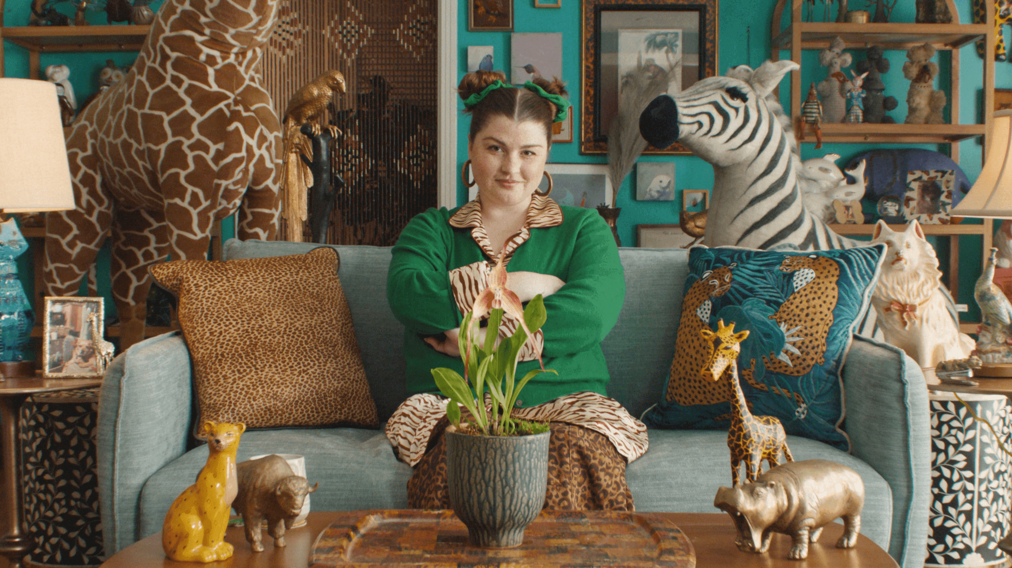
Google Chrome 'Monkey Orchid'
As a colorist, you're balancing people's expectations and managing a room. Louper was key to setting the look and getting the agency and client on board, to balance that vision out.
I loved the look of the Google Chrome spot, the whole scene was so colorful and layered.
That project was a lot of fun. The director, Hal Kirkland, had a vision and a look that he wanted for those spots and we really leaned into it. We wanted the audience to feel like they were in the space with the talent, because it's a Google spot and they want to show a product that everyone is able to use. So that was our vision, to keep it as natural as possible.
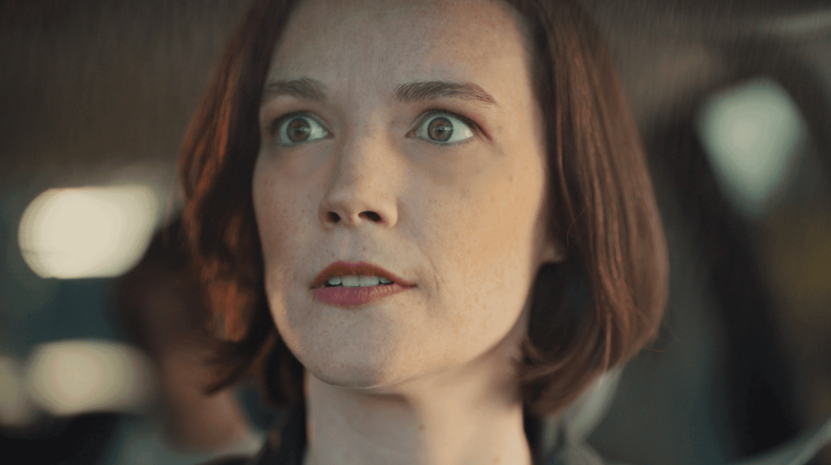
Still from Krispy Kreme Donuts 'Better be one for me"
The casting was really great. Likewise for the Krispy Kreme spot, the lady had the most incredible eyes. Do you find that creatives are pushing the casting for more interesting looks?
In the work that I've been doing recently, the casting is very deliberate. And I find myself in sessions commenting on the talent. I'm like, "where did you guys find this person?" And then there's a whole story about being on set with them, and how funny they were, or how much they loved that one talent and so on. They're like, "we picked this person because of their features" or "we put this person in this piece of clothing because it helps emphasize the product". So most of the time it's extremely intentional, especially on commercial.
On that Krispy Kreme spot, I found myself pausing on her close-ups because she had a look that worked so well for the spot. I was actually using those moments as hero moments and always making sure everything matches back to her. She was really captivating, and her expressions were key, because she's not really talking in the spot. So I was really playing off of that for sure with her.
Krispy Kreme Donuts 'Better be one for me"
Can you talk about developing the look for this spot?
We didn't have any hardcore references that we were leaning into. We just had specific things that we wanted to focus on, like the donuts, of course. But if there's a product, I wanna make sure I'm hinting towards that a little bit. So the grade ended up being a little bit like a clear-glaze donut. It wasn't clean, but it has some fluff to it, it has some doughiness to it, especially with talent skin tones. When I started out, I worked a lot with beauty, so I am always looking at everyone's skin tones. There were a few different talent skin tones to work with in terms of shades, so I just wanted to make sure everyone's skin looked really natural and really good. But there was this sense of doughiness to it that I think really helped lean into like the Krispy Kreme Donut aspect of it.
The grade ended up being a little bit like a clear-glaze donut. It has some fluff to it, some doughiness, especially with talent skin tones. I think that really helped lean into the Krispy Kreme donut aspect of it.
Google "Monkey Orchid"
How does the experience differ when you’re grading for a big brand like Microsoft or Google compared to a smaller, independent project?
Really, the difference is that there are more eyes on it and more steps of approval. You're working with your creative director and your director, making sure the vision starts on a healthy foot. And then you're moving on to different parts of the agency, client approvals. But I like getting a creative director's input along with a director's input, especially a DP's input, because I'm working on the things that they lensed. So for me, when I hear I'm working on a project with a big brand and the agency, I'm excited because that's more collaborators to really help make something special. And when I hear a short film is coming in, I love it too because it can be a little bit more intimate, and you can have a bit more time to craft something and make it more story-oriented.
Microsoft 'Co-Pilot'
You studied film at the Savannah College of Art and Design (SCAD) before working as a color assist at The Mill. What advice would you give to a young colorist just starting to build a career?
When I was younger I was always on YouTube, learning the technicalities of color grading, how to set up a project, color pipelines, learning your different cameras. So yeah, there's a technical side, but the other side is communicating with clients and working with clients. And I feel that with a platform like Louper, because it's so cost effective and the quality of the product is so high, you can be getting that muscle memory of working the grade while talking to the client and getting their vision.
Still from Microsoft 'Co-Pilot'
As a colorist, when you first start, you're working on short films, music videos, you might have a local car wash commercial that you’re color grading, that you're trying to make look cool. But we all want to work on those big brands. We all want to work on the Googles and the Nikes. You have to sit in a room with those clients and be able to articulate your vision and help translate their vision. It's different working while a client is live with you in a session than it is working offline or unattended.
It's different working while a client is live with you in a session than it is working offline or unattended. People want to be talked to, they want to hang out with you. To have a platform to do that in real time is super key.
At SCAD I would have my friends come over and I would treat them like clients. I would sit down with them, talk to them, and I would work in front of them. Because as a colorist, you're also entertaining a room. So for someone who's starting in the industry, start practicing that. So that when you do get in a session and you're with someone in person, it’s less of “I'm gonna sit here and just work”. People want to be talked to, they want to hang out with you. To have a platform to do that in real time is super key. So start practicing with that as soon as possible.
Portrait of Calvin Bellas while studying at SCAD by Eilish Nobes
Calvin Bellas is a colorist based in New York City. He is represented by Royal Muster
Calvin uses Louper to livestream his color sessions from DaVinci Resolve. See how to set up a stream from Resolve here.
Credits:
Everlast "Gonna Dance". Agency: Doubleday & Cartwright. Director: Zackary Canepari. DP: Bradley Credit. Editor: Jim Helton at Final Cut Edit. Colorist: Calvin Bellas.
Travis Scott "Kick Out" Music Video. Artist: Travis Scott. Director: White Trash Tyler. Colorist: Calvin Bellas.
C4 Energy Drink "Kevin Hart". Agency: Hartbeat. Director: Mark Nickelsburg. DP:Isaiah Donte Lee . Editor: Eric Wais. Colorist: Calvin Bellas.
Google Chrome "Monkey Orchid". Agency: 1000 Heads. Director: Hal Kirkland. DP: Natasha Braier. Editor: Tyler Horton. Colorist: Calvin Bellas.
Krispy Kreme Donuts "Better be one for me". Agency: VML. Director: Michael Clowater. DP: Tico Poulakakis . Editor: Brandon Porter. Colorist: Calvin Bellas.
Microsoft "Co-pilot". Agency: Passerine. Director: Adam Tillman-Young. DP: Kai Saul. Editor: Aika Miyake at Work Editorial. Colorist: Calvin Bellas.
Use Louper to stream and collaborate on live shoots, edit sessions, vfx reviews and more - securely and in seriously high quality.
