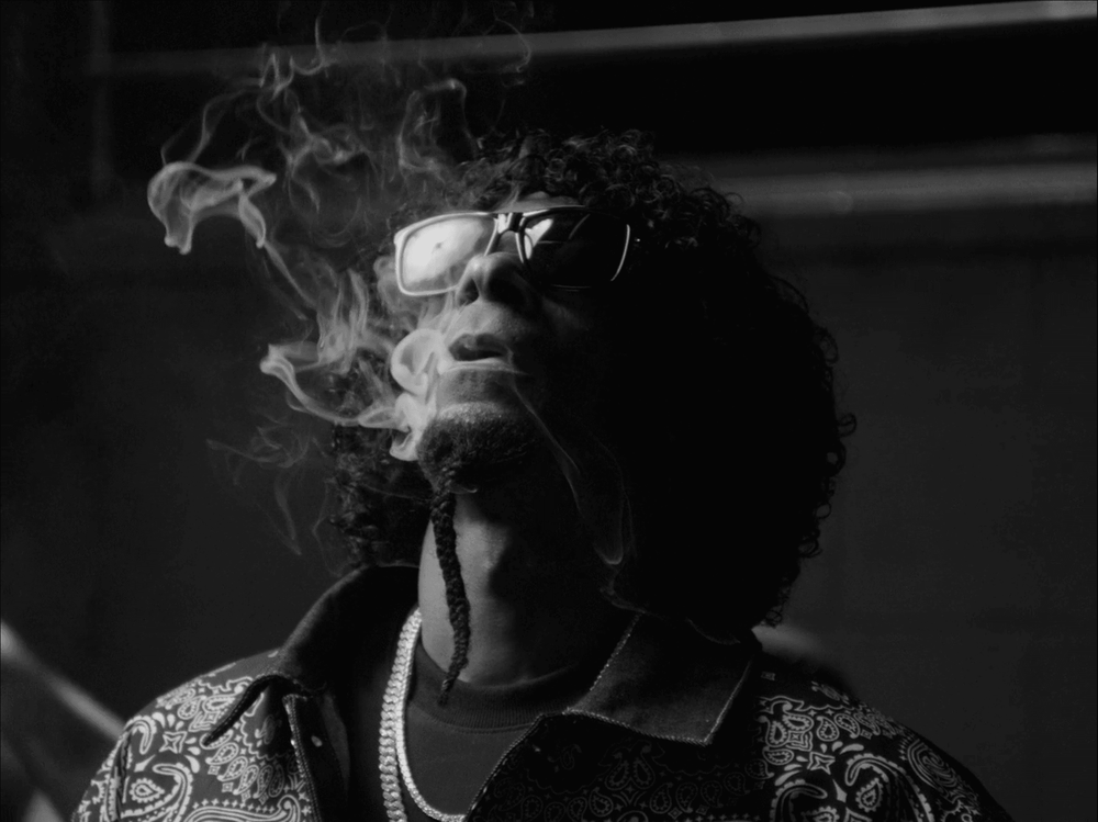
The Complexity of Monochrome: Colorist Daymian Mejia on shaping Snoop Dogg’s Ten Til' Midnight
The Complexity of Monochrome: Colorist Daymian Mejia on shaping Snoop Dogg’s Ten Til' Midnight
Daymian Mejia of Nocturnal Post shares his process on grading black and white, his approach to ensuring clients have the best remote monitoring experience, and how Louper’s tools have made it his trusted all-in-one platform.
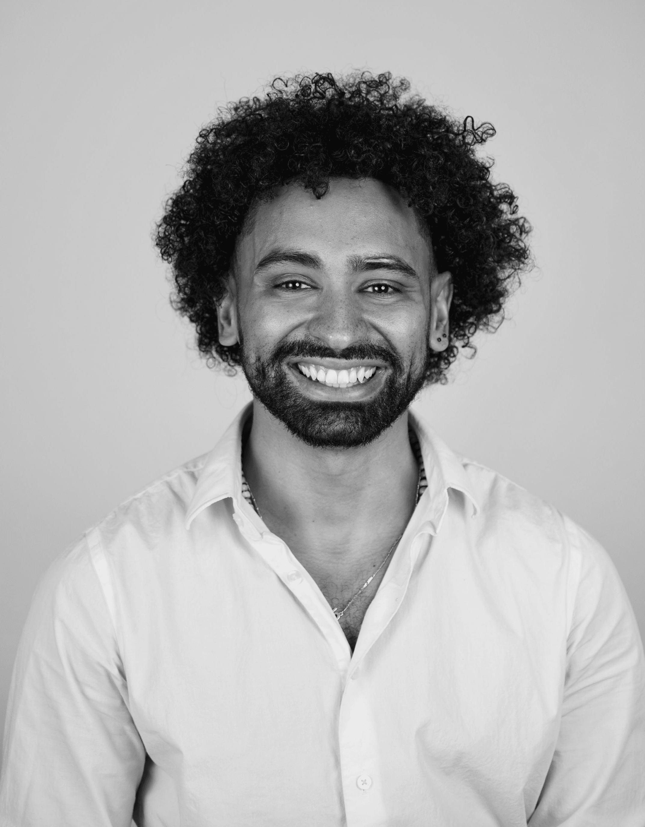
Daymian has worked for over a decade in color and post-production grading long-form narrative, commercials, and branded work, across New York, Los Angeles, and Boston — from The Mill to Trafik, and now as co-founder of the creative film collective, Bodega Plus.
You originally started out in cinematography. How does that influence your work as a colorist?
As a cinematographer you're hyper-focused on lighting, which definitely influences how I approach my work now. As a colorist, you understand that everyone on location is grappling with inconsistent lighting from sunlight coming in and out, clouds, etc. So while a big part of my job is to develop the look for sure, it's also as important to make sure the shots match and feel seamless. You need to set shot one - your hero shot - and figure out, okay, how do I get everything else to at least feel this way? Because you can’t get it perfect, right? Unless you're in a studio and you build out the entire set, you're not gonna have a perfect reproduction of every single shot, at every single level.
Totally, so how do you create that balance?
I'm big on the idea of leaning into imperfection, but what I learned from assisting Daniel De Vue at Trafik is that the viewing experience should still feel good. So, if I have four shots in a sequence - shot one and shot four don't have to match perfectly, but shot three and four should flow together because people are watching the shots in sequence. They're not watching it the same way that an editor or director might watch it…going from shot one to shot seven and then back to shot two. They’re gonna see it from shot one sequentially through to seven. You’ll see it on my color page because I'll have a node for one shot and then four shots later I'm doing something completely different, like maybe desaturating it a bit more because the surrounding shots need to match. So when shots are sandwiched together, I want that sandwich to be very edible no matter what.
Can you talk us through your process of converting the Ten Til' Midnight film into black and white?
My node tree is definitely nutty because I learned how to color on Baselight. I now operate with a pre-fixed layer structure, so I have this fixed node tree. It looks insane. I'm very aware, but it's basically designed in a way that I can apply it to every single shot. And then I don't have to worry about adding new nodes. Of course there are times I have to add new ones if clients have a lot of notes, but in general, it pretty much covers all of my bases.
When it comes to the actual black-and-white conversion, I'm using a pretty standard CST (color space transform) in and out workflow. And then between those, I apply either a LUT or maybe some type of weird filmic conversion that I have going on, depending on the look I’m after. That all happens before the final CST, so I'm essentially grading the image in log. I’m primarily focused on the tonal values so I'm grading the entire image before it even gets converted into black and white.
And then there's the conversion that happens before the CST output. And that takes it all into black and white. Sometimes, especially for black and white, you can continue grading after the CST, because we’re now working with a Rec. 709 image. That gives me more control over the contrast and really getting these deep, rich blacks. Depending on the shot, I might also add additional power windows, shapes, or other targeted adjustments to fine-tune the final image.
I like working with black and white a lot because I feel you can really experiment and push the image. Some people might think you just desaturate, add contrast and you're good, which sure, sometimes you can do. But I think there's a lot to do with values to draw a large amount of information out of the image.
What was the Ten Til' Midnight brief?
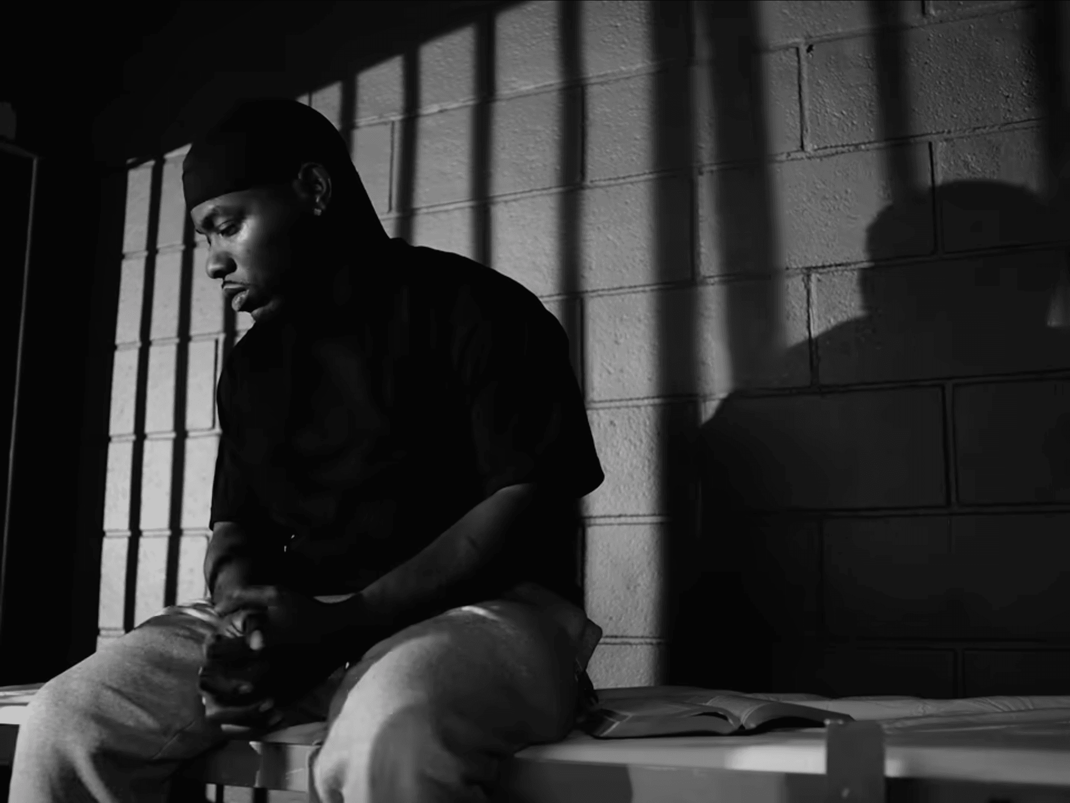
The DP and the two directors knew straight out the gate that they wanted it to be black and white. There wasn't this idea of shooting it in color and then deciding last minute in post to make it black and white. They were very intentional about it - we even jumped on a call before shooting started to talk it through. And fortunately, the DP had a ton of references which I always vouch for because, what I consider black and white and what he considers black and white may be two totally different worlds, right?
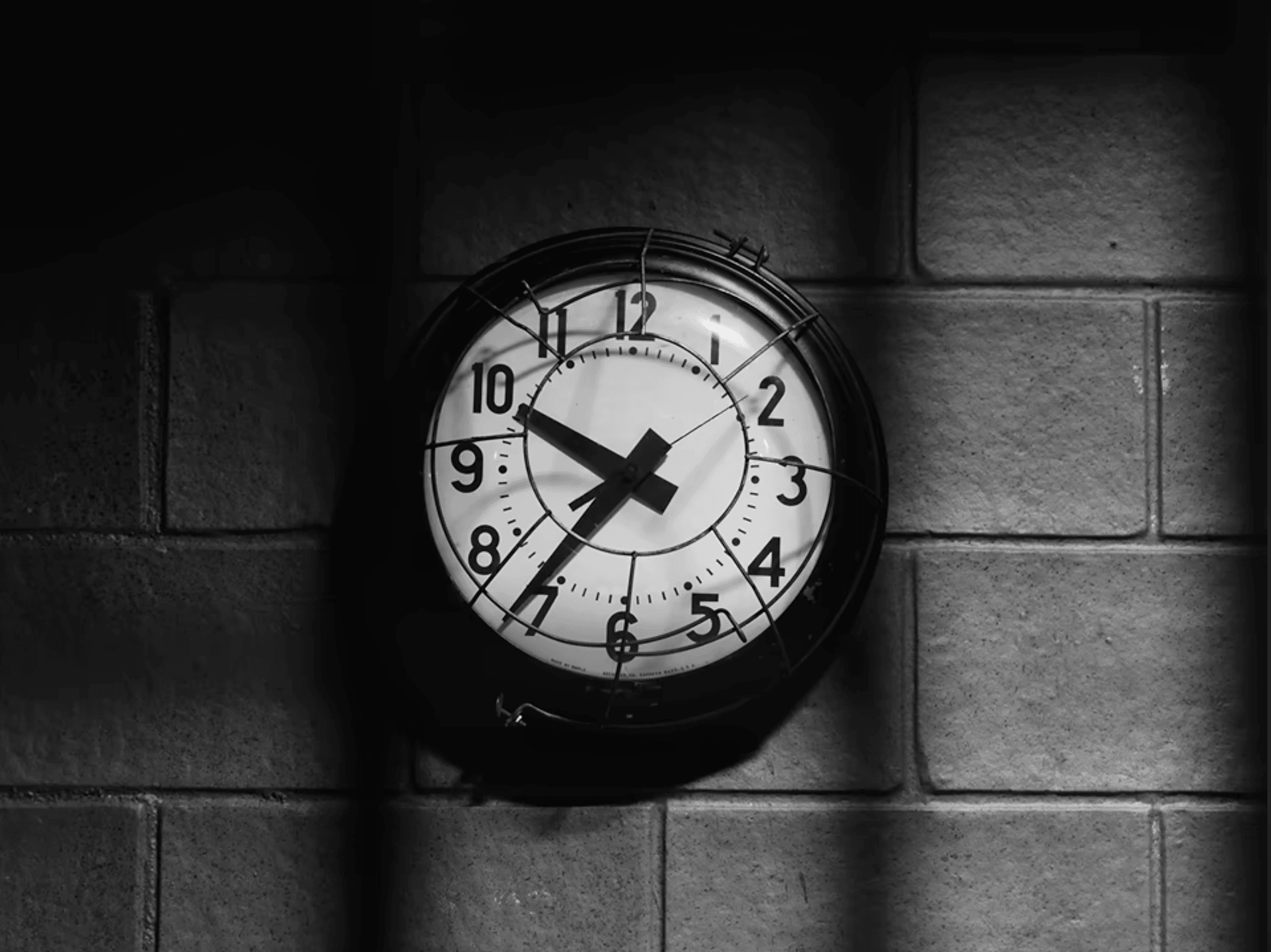
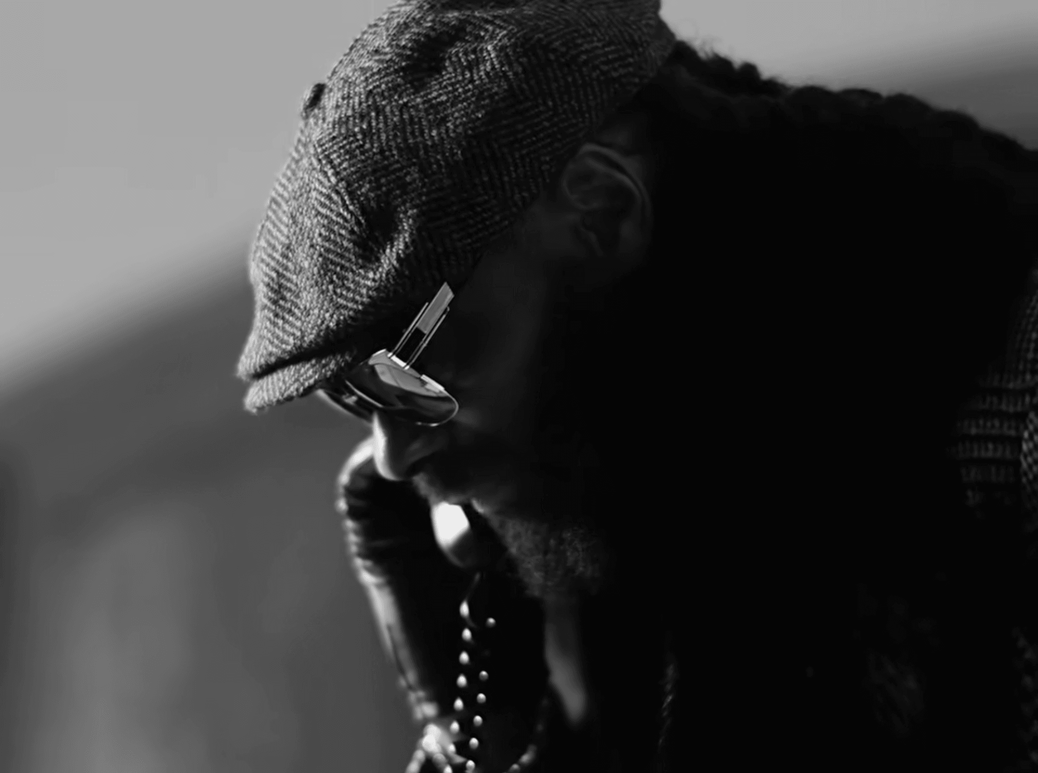
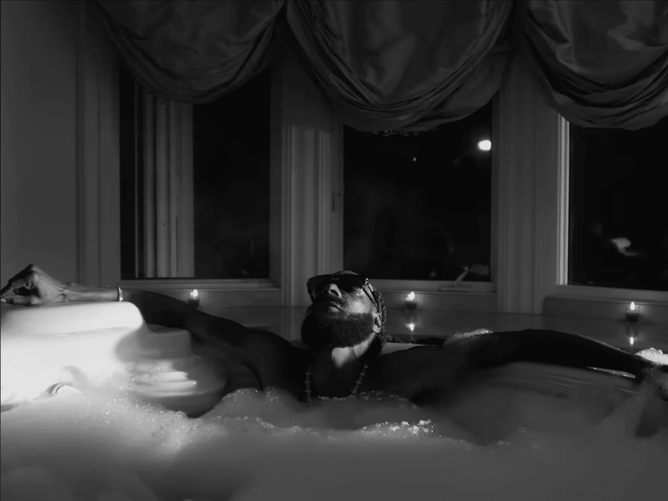
They were thinking about super contrasty, very moody references. We really prioritized this idea of shaping the image, so it felt a bit painterly which is one of the benefits of black and white. But it can be a double-edged sword because one of the downsides of black and white is that you have to be mindful of the values. We can make something both beautiful and really shaped, but at the same time, we want to make sure that there are gradients and that the values make sense so it doesn't feel unnatural. So the DP and I were always asking, does this make sense?
Totally, in terms of mood it definitely has this film noir feel to it.
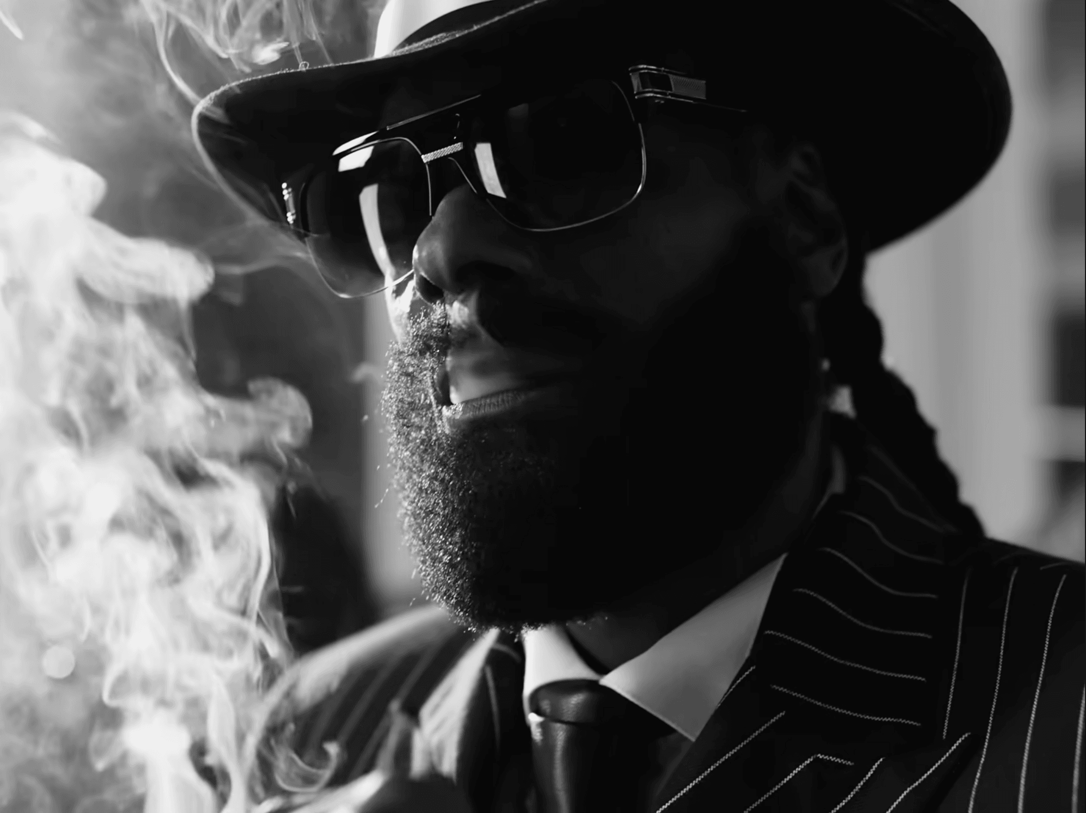
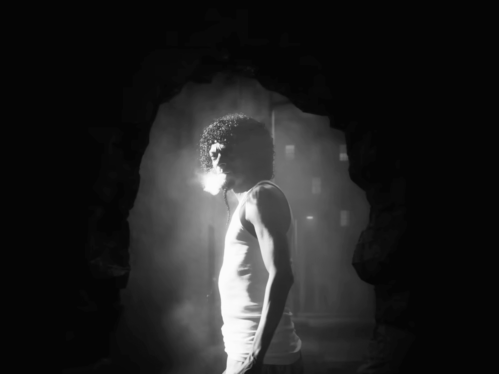
Yeah, a lot of the references were in that world. Since it’s a gritty story, the filmmakers were really trying to preach the idea that the blacks should be very black and there should be a lot of contrast, so it ultimately all made sense for the story. It wasn’t being done for it to just look cool visually. It was about using black and white to move the story forward.
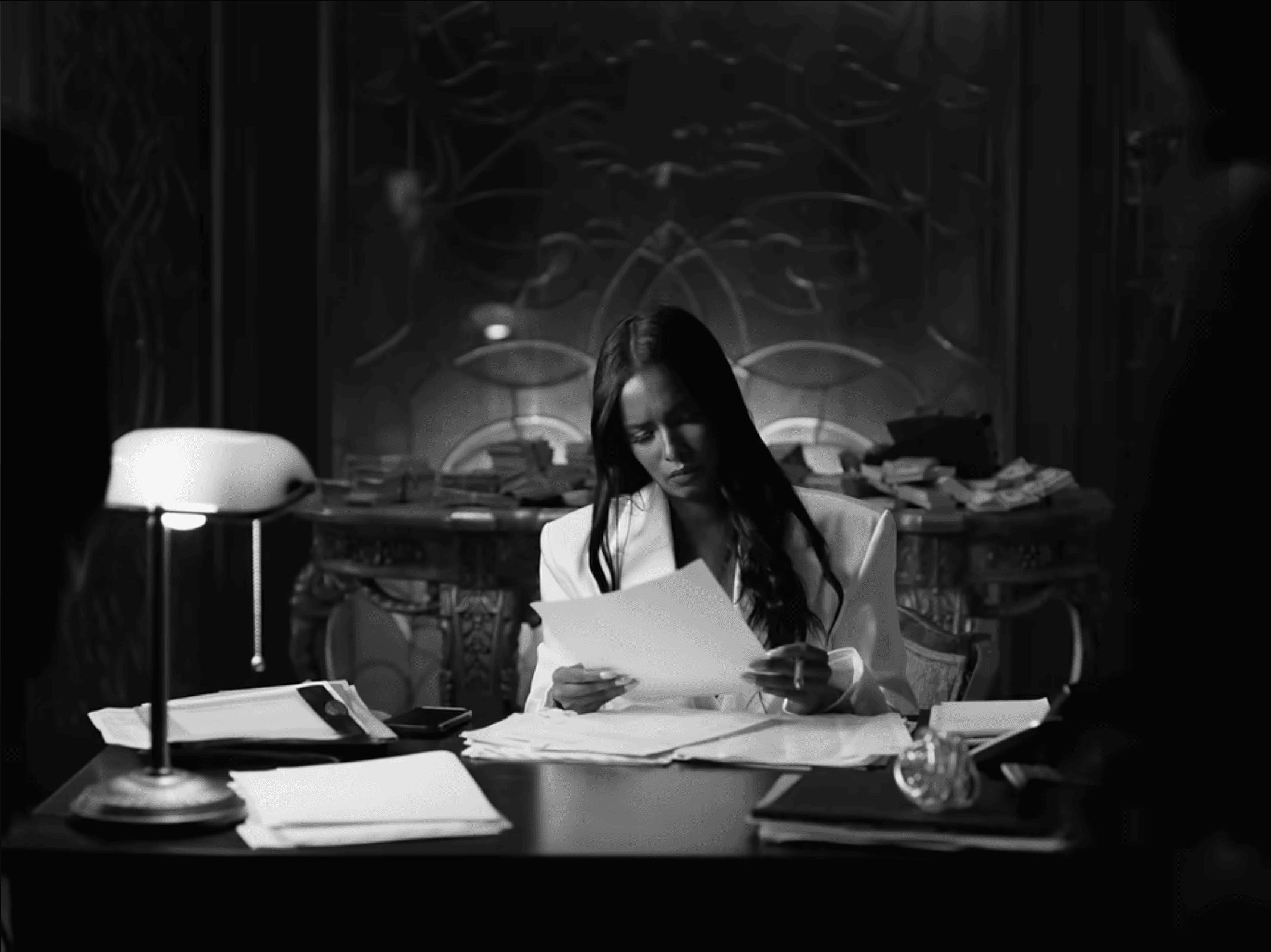
Absolutely, but shooting digital can have that flat contrast so you do really have to work it in post.
Totally, and sometimes that is the direction some filmmakers want to go. Off the top of my head, if a black and white film like Nebraska had super contrasty values, it would have taken the audience out. But in a way it had this very minimal black and white feeling and it really allowed you to lean into what was a very emotional story.
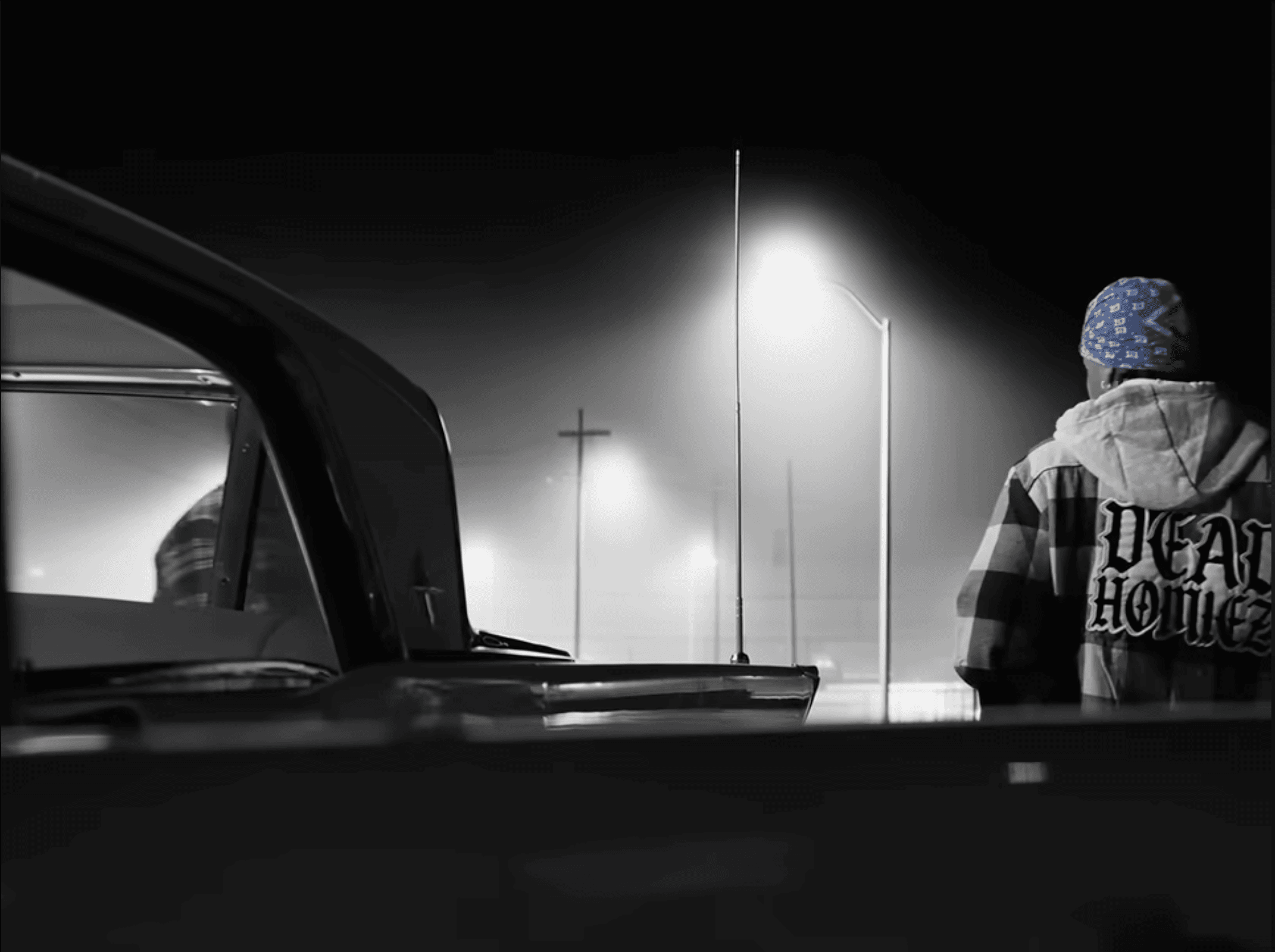
Exactly. And that's the power of all the different facets of film working together to tell a story. Can you then talk about how the isolated color of the red and blue bandanas was introduced?
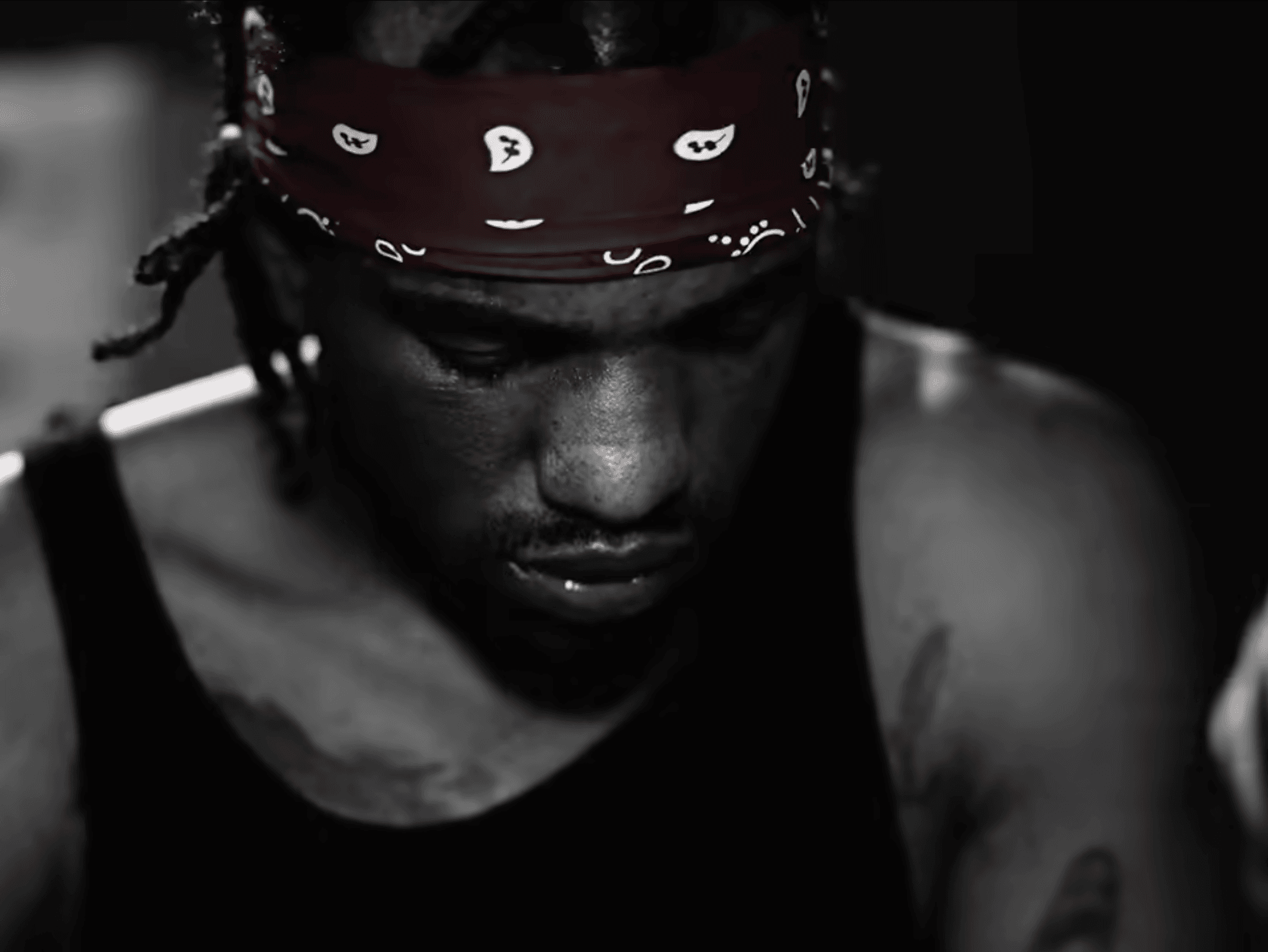
Yeah, for sure. So, the bandanas are primarily representative of something that Snoop Dogg has preached for almost his entire life - the idea of gangster culture and the type of elements that are very common within Southern Californian lifestyle. But introducing that element was a bit of a curveball, because we couldn’t ensure that there would be perfect color temperature on the bandanas at all times during the shoot. So from a technical standpoint, it was a two-layered process. We had the VFX artists roto-ing out different elements, and then once that came back, we'd do another pass in color. At that point, we'd essentially have this clean plate of the bandanas, which gave us the flexibility to go in and make additional tweaks where needed.
Although VFX handled most of this element, we wanted to make sure that it integrated into our black and white world, which then naturally required us to do a whole other pass of it, rather than trying a color isolation tool within Resolve or like hue angles.
How was Louper used during the post-production process?
There was so much footage and we took our time with it. One of the luxuries of using Louper for most of the process was that we were able to be precious about every single moment. Our first two look sets were about two hours long each and then as we got deeper into the film, we had eight hour sessions, so we were utilizing the entire maximum amount of time we could get per session.
One of the benefits was experimenting with the different bit depths. Having that type of flexibility and quality control on the Louper side was very helpful. And because we were so conscious about shaping, the DP and directors loved being able to circle something or draw anywhere on the screen, rather than trying to explain what they meant. The DP would be like, can we shape this part right here better? And I had the Louper room pulled up in my top monitor so I could just look up very quickly, see exactly what they meant, go back into the project and almost immediately start working on it. So that type of annotation is very, very cool and that tool alone was really useful to all of us.
Also, I love connection. I love being able to see people, so the way Louper has the video call chat aspect, to be able to see who I'm on the call with, and see their faces, is great for me. There are other services out there for sure, but Louper really tries to be this all-in-one package where I can talk to my clients through the video call and then at the same time they can annotate, and I can get this guaranteed high quality stream so I don't feel like I have to compromise. And from an affordability standpoint, it's just very convenient, compared to other platforms that I've worked on...where they're great, but they require way more technicality and cost and they don't have all these features in one place that Louper offers, which were really essential to our team.
How do you ensure that your clients have the best monitoring experience in a remote session?
It’s a bit like the Wild West for sure.
I often actually recommend iPhones because iPhones out the box are fairly good, fairly well calibrated. But if my clients are local, like on the East Coast, and depending on how long the project is, or if it's a feature film, I’ll send an iPad or we'll go a bit deeper into the calibration. For a quick commercial, I’ll run through a couple of monitor display settings on their end and just ensure that everything looks good, go through the basics like True Tone, Night Shift. I mean the amount of people that don't even know what True Tone does, but yet it's always turned on, kind of blows my mind! Recently I was talking to graphic designers and I was trying to explain to them this concept and they were like, ‘wow, I've had this on my entire career’. And it's mildly concerning because obviously I get the purpose of True Tone, it has usefulness for sure. But as a creative, unfortunately there's not one button that fixes everything. Apple now has a Reference Mode, but even that stills need to be calibrated.
For me, the starting point is just ensuring that people have True Tone and Night Shift turned off. I've had clients look at a link late at night and Night Shift is turned on and they're like, this seems so much warmer. So having to always go through that can be frustrating, there’s no other way to put it, but that’s why setting up is an important part of the process.
Yeah, we've heard of colorists whose clients have stopped on the side of the road looking at the link on the highway in bright light on their iPhone, so as you say, it can feel like the Wild West sometimes…
Yeah, I always say there's like a ten percent discrepancy, right? And usually it's not in the saturation but brightness and things of that nature. Of course, you occasionally have to be mindful of weird saturation or color tints, etc.
Was working on a Snoop Dogg music video a pinch me moment?
Yeah, I remember growing up listening to Snoop Dogg. My father would play his stuff and so just being able to work with somebody who has had such a strong impact on rap culture is just, "wow, crazy". It’s definitely a bit surreal. And also to do it from the perspective of creating something that we genuinely want to put out into the world is great. We were able to make a black and white piece for one of the biggest rap artists of the past thirty years. That’s just crazy to say out loud.
How did the project come to you?
It’s actually funny because I tried reaching out to the director a couple of times over the years on his Instagram, but my messages never landed. Then, completely out of the blue, he contacted me about a different project that needed a colorist. We ended up working together, and that’s when he mentioned he had a bigger project coming up (Ten Til' Midnight ) and wanted to explore black and white. It was a strange bit of synchronicity because there was never any formal bidding for the job.
I don’t know whether it's stubbornness or just dedication, but I have no problem reaching out to people because I always think if they don't open up my message, it’s okay, I did the most that I could, right? And then at some point if it's meant to be, it's meant to be - it's one of those things where you have to surrender to the process. That's the name of the game. I’ve lost jobs because other people have underbid or people can offer a better package because they're with a VFX studio or whatever. So unfortunately if you really think about it, your average hit rate is gonna be low, but you have to zoom out and think about it as a numbers game.
It's like there are a million jobs getting posted every single day. A million people looking for somebody to work on their project. It can feel like you’re posting into a void, but you never know when your name is going to come across somebody's desk.
Absolutely! Can you tell me a bit about your mindfulness for creators initiative? Most of the team at Louper, including myself, come from editing and filmmaking backgrounds so we can relate to navigating such a demanding, stressful industry.
The mindfulness initiative for creatives is called in-btwn because it's all about recognizing the space between the past and the future - the present moment. As creatives, it's so easy to have your mind in five different places at once, you can be on set thinking about invoices, another job, emails, while also trying to be fully present with the director because you have a scene to shoot in twenty minutes. But I've found that when I'm completely present, I simply do better work and I feel better. That's why I believe mindfulness is one of the most valuable tools we have. It doesn't have to mean sitting cross-legged for an hour - sometimes it's just five minutes of focusing on your breathing or even going for a short walk after a 16-hour day on set. It won’t solve everything, but if it reduces your stress by even five percent, that can make a real difference.
The goal of in-btwn is simply to help creatives reconnect with the present so they can create their best work, manage stress a little better, and find more enjoyment in what they do.
How do you feel that Louper is making life easier for creatives?
I can only speak for myself but always being able to offer a remote session to clients has become essential. It’s become standard for me. For example, a director may be juggling kids and multiple projects, and they’re like, “hey, I can only do a session at 9pm for 20 minutes and I can’t drive out to you at that time. Can we just jump on a remote session?” I’m like, absolutely, here’s a Louper link. It makes it a lot easier to squeeze in these quick sessions when I can send them a reliable link to a site that offers all these different tools, all on one platform, because it's an app that I trust wholeheartedly. Therefore I feel I have no problem saying, yeah, we can jump on at 9 o’clock, we can be twenty minutes and I can guarantee you'll get what you need. And when questions on quality and functionality come up, I’m like, Louper is good to go! Just that flexibility in schedule without compromising on quality is so important from a mindfulness standpoint.
Watch Snoop Dogg's Ten Til' Midnight short film.
All images taken from Ten Til' Midnight courtesy of Death Row Records.
Image of Daymian Mejia courtesy of Daymian Mejia. Photo: Geoff King.

Use Louper to stream and collaborate on live shoots, edit sessions, vfx reviews and more - securely and in seriously high quality.

