Don’t be Afraid of the Dark: Crafting the Look for Summer War
Don’t be Afraid of the Dark: Crafting the Look for Summer War
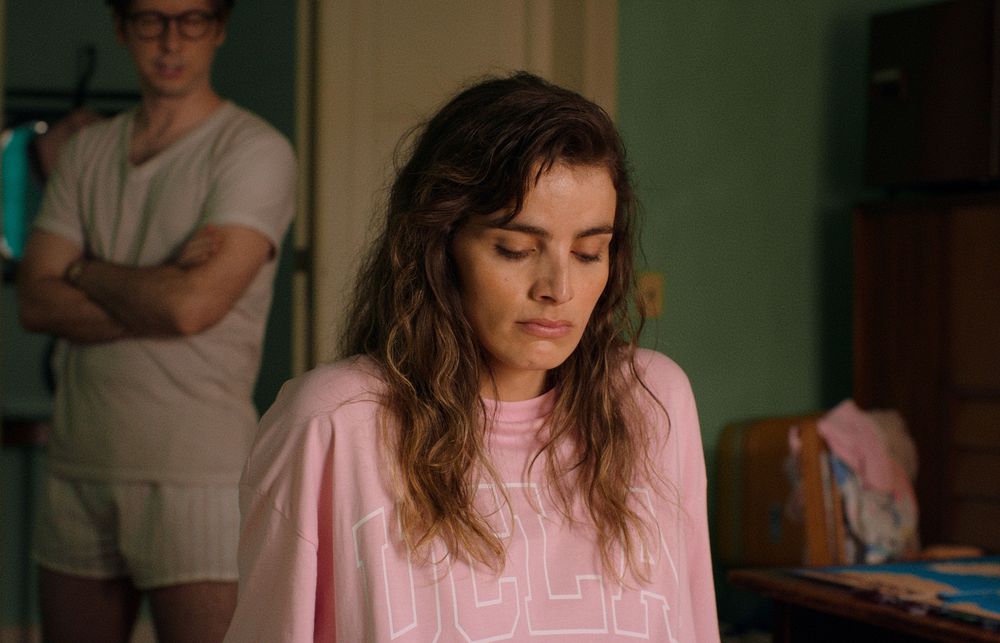
DP Alejo Maglio collaborated remotely with Thomas Woodroffe on the color grade for director Alicia Scherson’s film, Summer War. Set in Chile in 1989, the team worked closely to craft a visual language that combined the nostalgia of a beach vacation with the ever-present darkness of the fading Pinochet regime.
Summer War is based on Roberto Bolaño’s novel, The Third Reich. How did the book influence the visual storytelling, and as DP, what preparation did you do before starting on the project?
Alejo Maglio: The novel is set in the late 80s, so when Alicia first called me, we started by talking about what happened in Chile in that period, to understand the mindset of the people. Those were the last summers at the end of the Pinochet regime and it was a really strange time. After 20 years under a military dictatorship, they were now in a new world of freedom. It should have been the end of an era, but that hadn’t yet translated into the feeling on the street. It took many years to shake off the dictatorship, so that was the atmosphere we had in mind when we thought about how to photograph the movie.
Those were the last summers at the end of the Pinochet regime. After 20 years under a military dictatorship, they were now in a new world of freedom. That was the atmosphere we had in mind when we thought about how to photograph the movie.
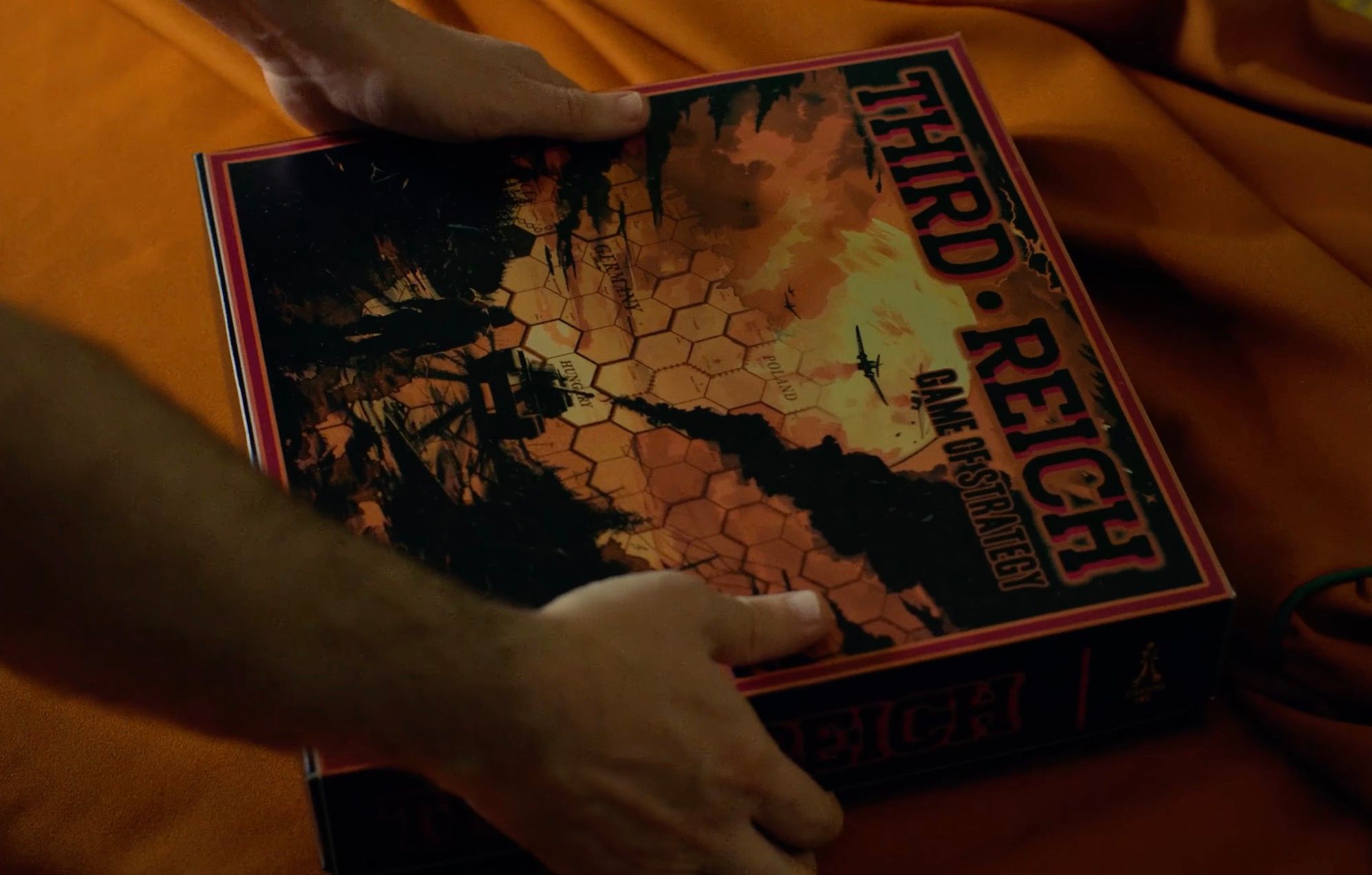
Udo sets up the boardgame
Another important theme is the military game, The Third Reich. It’s about the Second World War, so we also looked for footage from that war and were surprised to find a lot of color footage. The film is set on or around the beach, so I looked for footage of the Normandy beach invasion. I wanted to make an analogy between that invasion and the point of view of the main character, Udo, and how he saw the beach as a tourist. And the other point of view was from the local character, El Quemado. Alicia really liked this idea of showing the beach from these two points of view.
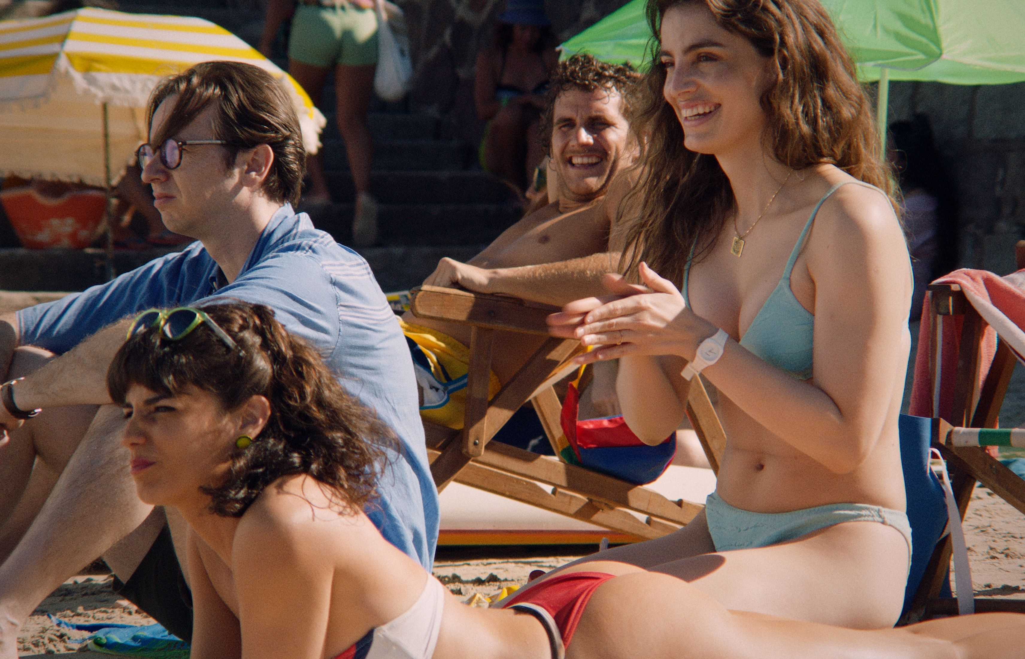
Tourists Udo (Dan Beirne), Lola (Malena Sanchez), Charlie (Agustin Pardella) and Ingrid (Lux Pascal) on the beach.
Alicia also had strong photographic references for how to shoot the beach, from Martin Parr and Robbie McIntosh, who have really colorful beach photography with bright skin tones, and Don Terpstra, who photographed Reñaca beach in Chile in the 80s. Terpstra’s photography has darker, brownish tones in the skin, which I found interesting. These people are on vacation, relaxing on the beach, but that brownish tone is something that represents, for me at least, something darker behind that period too, like the past is not so clear, and neither is the future.
These people are on vacation, relaxing on the beach, but that brownish tone is something that represents, for me at least, something darker behind that period, like the past is not so clear, and neither is the future.
Thomas, how were you briefed on the color for the film?
Thomas Woodroffe: The main thing that Alicia and Alejo showed me were those beach photography references. It’s funny, because if you see the film’s timeline, only about twenty percent actually happens on the beach in daylight. But this visual identity was very important to them - that you were able to feel the summer, this very hot, sweaty vintage feeling of the beach in the 80s. This was somehow the central part of the world, and then everything else was like an extension from that. So the first scenes we color-graded were the beach scenes. And only about a week after that did we start working on the other scenes, trying to understand how they could relate.
The visual identity was very important - this very hot, sweaty vintage feeling of the beach in the 80s. This was the central part of the world, everything else was an extension from that.
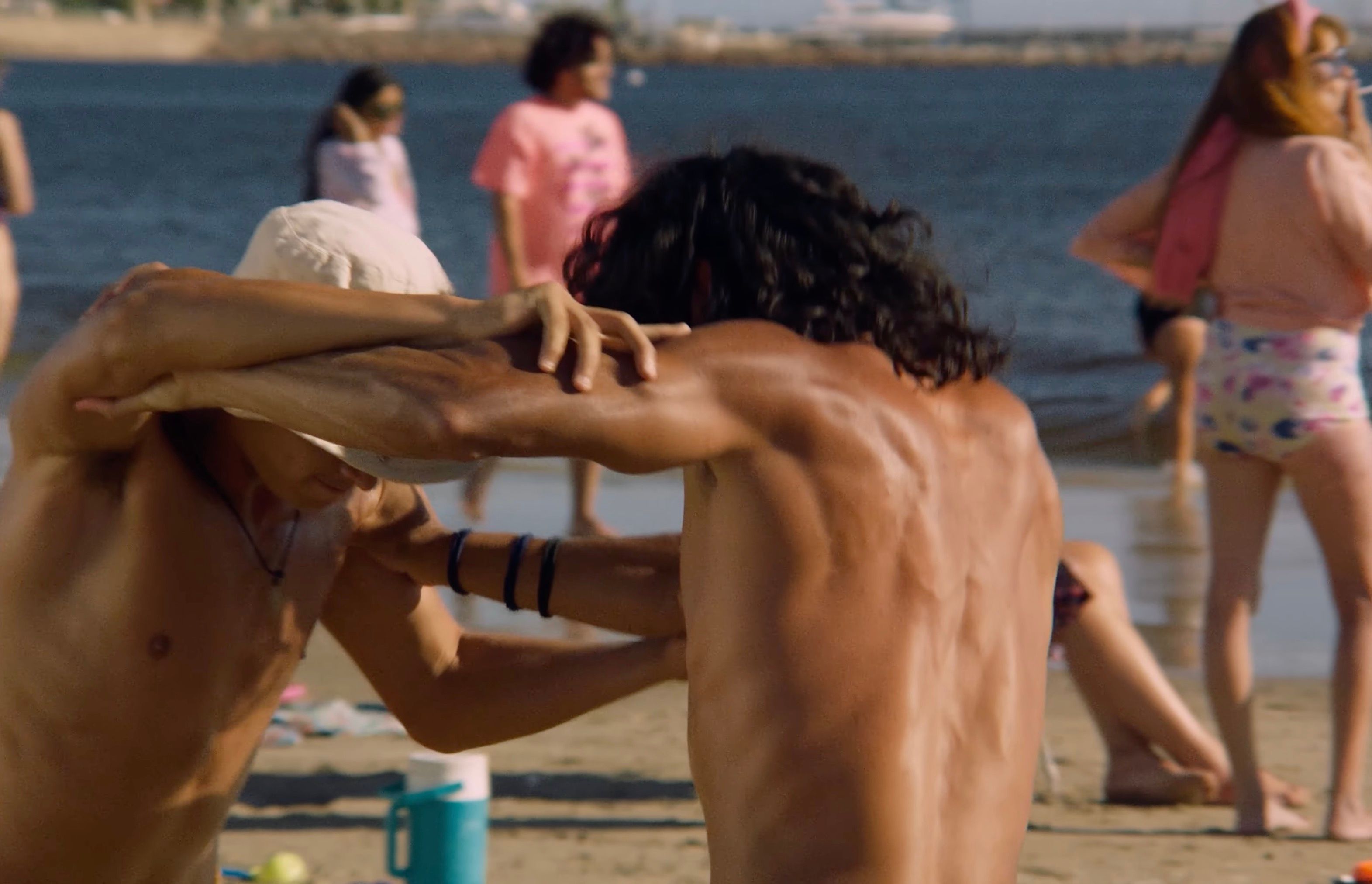
Wrestling on the beach
Alejo, what camera and lens kit were you working with?
AM: I decided to use tools from that era: lenses from the 80s, and the kind of lighting that was available in that period, like fluorescent tubes, incandescent lights, and HMIs, while avoiding modern technology like LEDs. The journalists in Chile at that time mostly shot on Nikon, so the lens we used was a rehoused Nikkor AI-S. I chose that lens because of the quality of the glass, I felt like I could capture the colors, the contrast, and that bright tone in the skin.
We only had a limited space that we could work with on the beach, and we had to avoid all the people who were there on vacation in contemporary clothing. So for those scenes we used a 25-250mm Angénieux lens from the 80s. With that we could blur the far background and soften any modern buildings or people, and concentrate on our characters and our extras. The only exception to that rule was the camera. Rather than trying to emulate 35mm, I looked for a digital sensor that could naturally dialogue with the lenses and lighting of that period. That's why I chose the ARRI ALEXA Mini.
The journalists in Chile at that time mostly shot on Nikon, so the lens we used was a rehoused Nikkor AI-S. I chose that lens because of the quality of the glass: I felt like I could capture the colors, the contrast, and that bright tone in the skin. For the beach scenes we used a 25-250mm Angénieux lens, so we could blur the far background and soften any modern buildings, and concentrate on our characters.
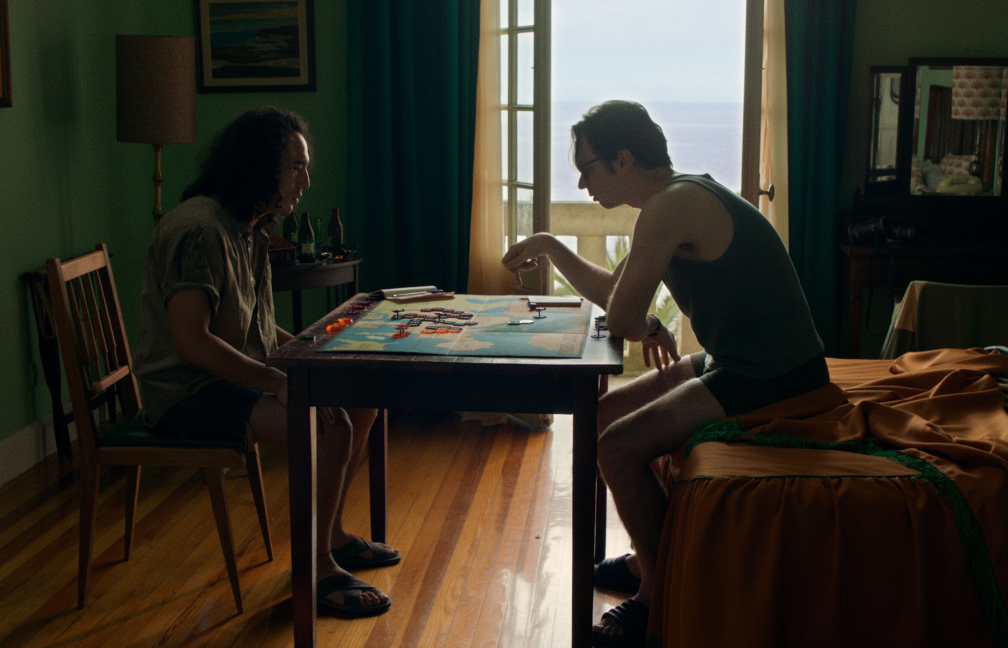
Udo finds a worthy opponent in El Quemado (David Gaete)
The hotel room had lovely green walls, which lent itself to a military feel later in the film, as El Quemado and Udo get stuck into the board game.
AM: Yeah, that color is thanks to the production designer, Sebastián Muñoz. We shot the hotel scenes in Uruguay, at the Hotel Argentino, and Sebastián rebuilt that entire world to match the late 80s. He changed the color of the walls, the bedclothes, the furniture, the practicals, everything. It really helped shape the psychology of both characters. Likewise for the scenes on the beach: the umbrellas, the chairs, the kayaks, everything was from the late 80s. For a DP, the production designer is always really important because you light what they put in front of the camera. It’s really a team effort.
TW: The clothing and costumes were also very precise in these intense colors, with a lot of saturation and richness, and specific color palettes that were in fashion at that time. That made it a lot easier to build this look, and match the nostalgia and the aesthetic of the late 80s.
For a DP, the production designer is always really important because you light what they put in front of the camera. It's really a team effort.
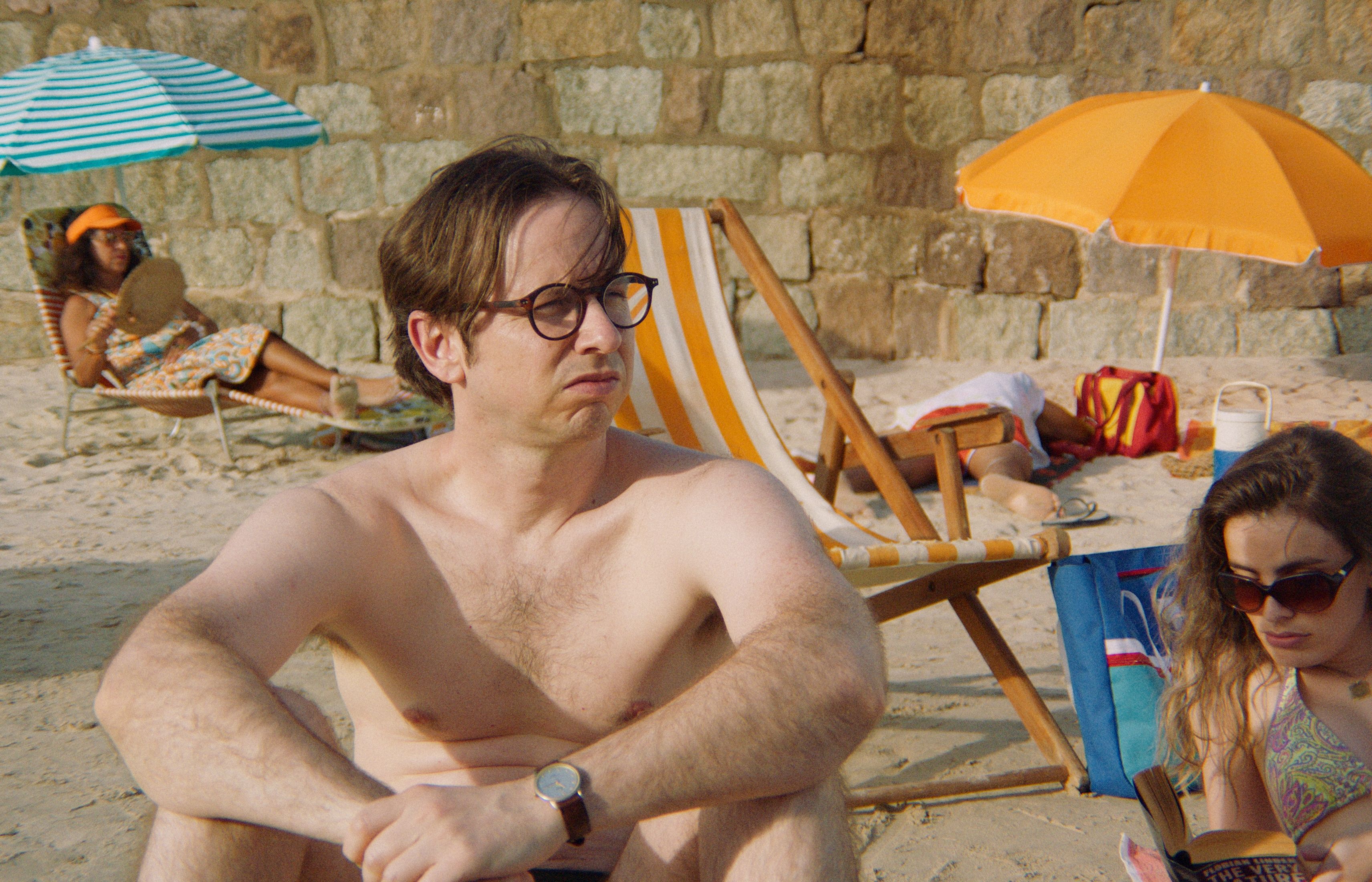
Udo and Ingrid on the beach
Thomas, having grown up in Chile, was it interesting for you to revisit that time in your country's past through the lens of a creative project?
TW: Yes, totally. Usually, when we talk about the dictatorship in Chile, the period that is portrayed is the beginning of the dictatorship, which was a very important moment globally. It marked the end of the socialist dream, and it’s when most of the human rights violations happened. But we don't have a lot of portraits of that later period, rethinking the end of the dictatorship.
The novel is interesting because Bolaño chose not to write about the political dimension from an activist stance, but instead used the politics as an ambience, something you could feel in the air. People are still living their lives, but there's something very dense that remains present: traumas that they don't talk about, things you cannot say in a public space. But a person from another country doesn't know these limits, and they feel the tension without fully understanding it. There's something very interesting there, very unique, and I think Alicia was able to represent it very well.
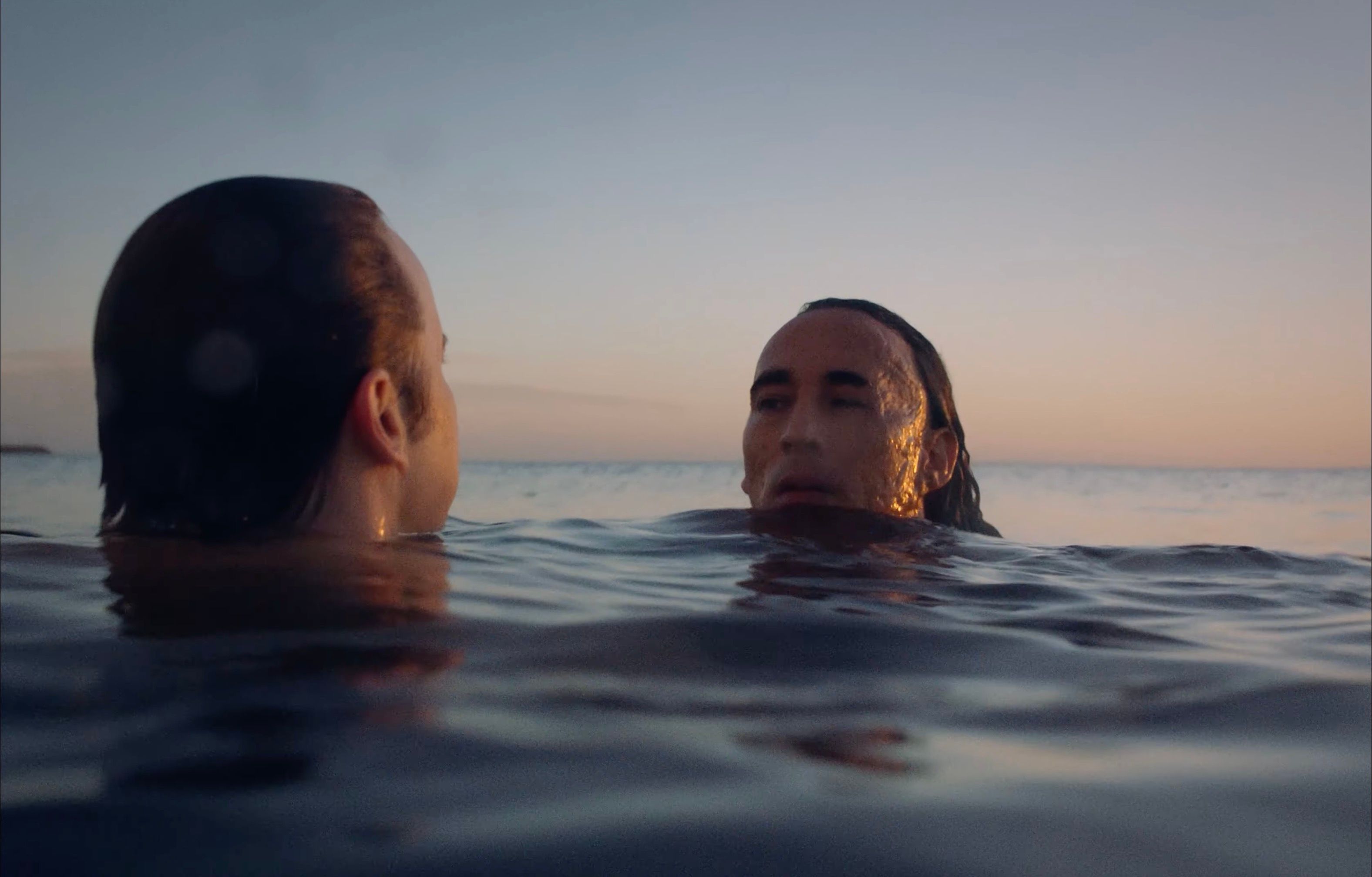
Udo swims with El Quemado
Yes, that's a very good point: seeing it through the eyes of a tourist gives you the chance to explore those boundaries.
TW: Yes. There are a lot of stories that you would know if you came from Chile. For example, a grandfather of a friend was a militant against the dictatorship, who helped people cross the border to escape from Chile. And he physically modified his face three times, to avoid being recognized. So a character like El Quemado would feel familiar. And then from Udo's side, the fact that he travelled to Chile when he was a kid, while his father was there on business, means his family was probably related to the dictatorship somehow. It's not something that anyone seeing the film would necessarily pick up on, but someone from Chile is going to recognize those details.
There's something very dense that remains present: traumas they don't talk about, things you cannot say in a public space. But a person from another country doesn't know these limits, and they feel the tension without fully understanding it. There's something very interesting there, very unique, and I think Alicia was able to represent it very well.
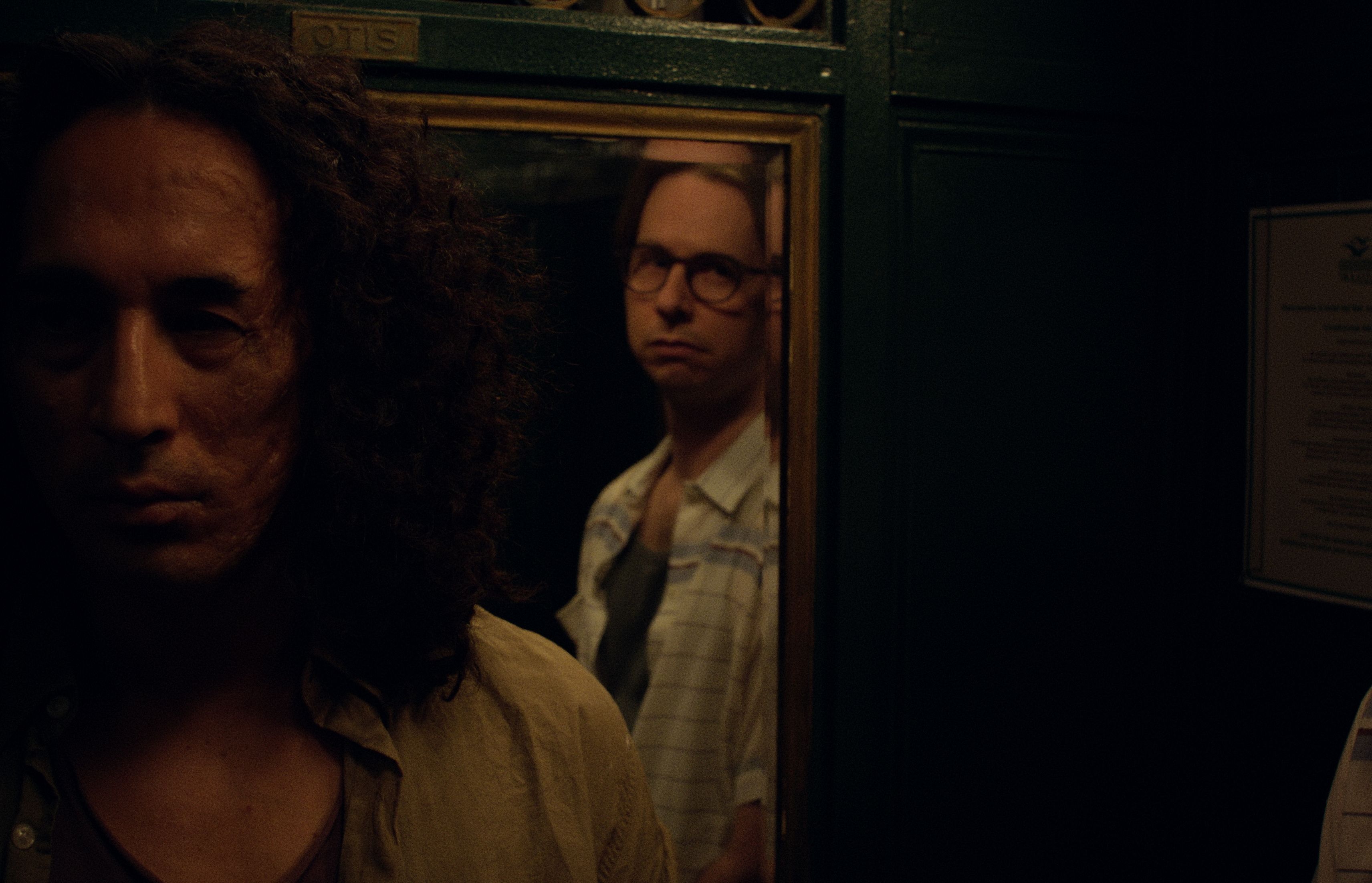
El Quemado and Udo in the hotel elevator
How challenging was it shooting those night scenes on the beach?
AM: Being set in the 80s, especially in a small town, the beaches were not lit up like they are today. The Nikkor lenses are really fast, and with 800 ISO you can deal with low light, but it was difficult because I'm not a person who likes to add a lot of light or make a really bright image. I always like to know where this light comes from and make the light feel as natural as possible. You could say the light comes from the moon, but it required a really big build, so that was the most challenging part, I think.
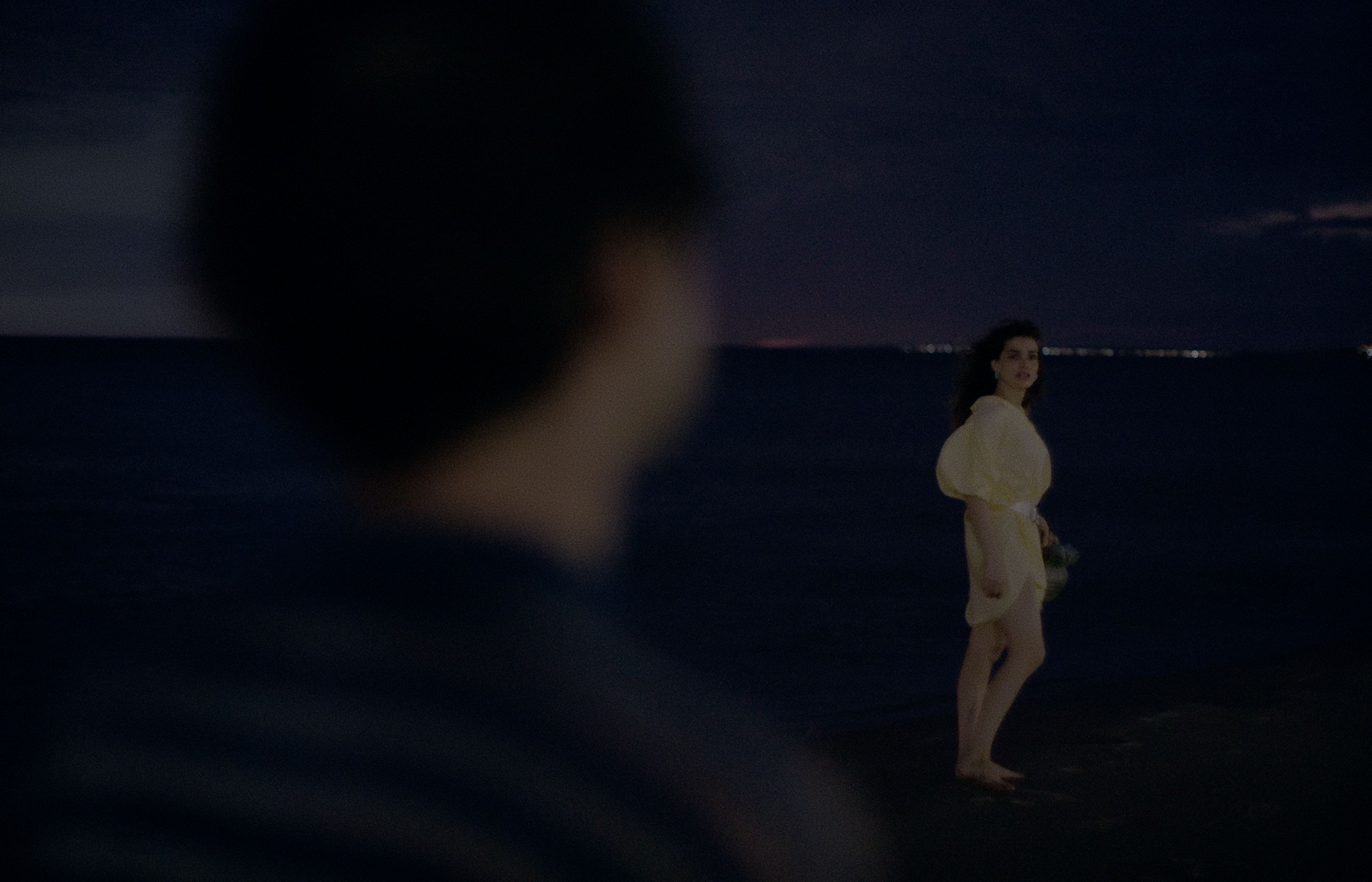
The beach at night
Thomas, how did you approach the color correction for the night scenes?
TW: I initially did the color correction with more saturation, because the rest of the film has a lot of saturation. But Alicia felt strongly that moonlight doesn’t give you the ability to see color because it's such low-intensity light. For her, moonlight should feel much closer to white than to blue. And very desaturated. So we pivoted the nights to that look.
There's something almost emotional when an image pops, it makes you feel something. When we started out, making the nights more bluish and with more saturation, I think we got to a point where it had this pop. And then when Alicia asked for something different, it meant starting over and finding the pop in a new way. Ultimately, I really liked where we ended up with the night scenes. And it was a lesson for me - that nights don’t always have to be blue, that those preconceptions can be broken.
Alicia felt strongly that moonlight doesn’t give you the ability to see color because it's such low-intensity light. I really liked where we ended up with the night scenes. And it was a lesson for me - that nights don’t always have to be blue, that those preconceptions can be broken.
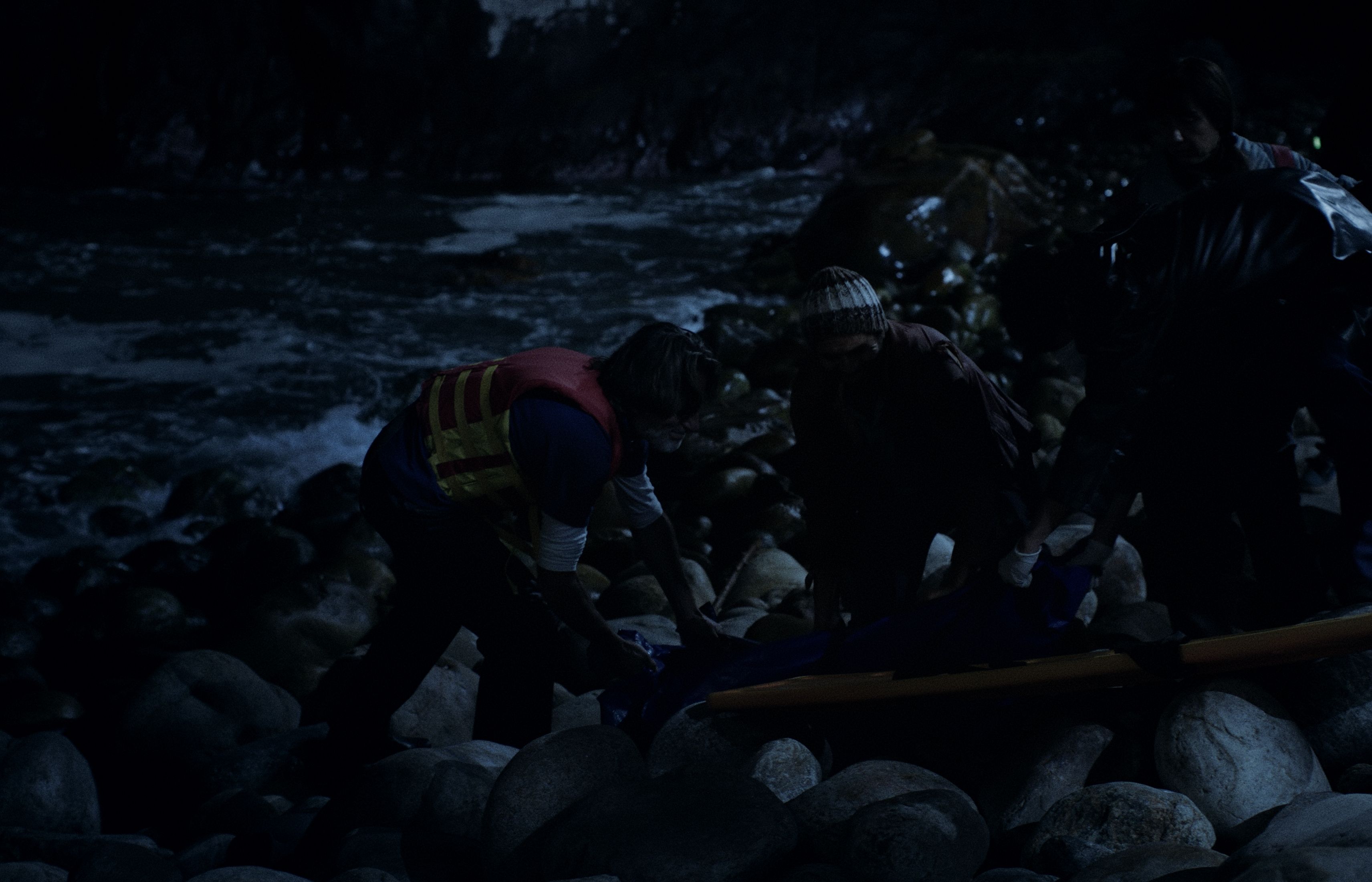
A grim discovery
I loved the scene on the beach where you had this really unusual framing of Charlie and Lola: you see their bodies, and hear their dialogue, but their heads are out of frame.
AM: It's something I like to do - to cut bodies with the border of the frame. And in that sequence, we composed the frames with one leg, or part of the body, or even their heads outside the frame. Sometimes it’s good to take that kind of risk. In this scene, they have just had a violent argument, and now she’s sitting on his lap like nothing happened. So that is represented in the frame, like they are disappearing, but they are still there. It's the same with the military government: they are still there, but they are disappearing. You can use the framing to transmit that message in a subtle way.
TW: Yes, the framing is incredible. I think it also relates to the human side of that scene, because Udo and Ingrid are looking at Lola through a cultural lens that is very different, and that is where the tension is. Just the night before, Lola had said that she would never go back to Charlie. And I feel like in the Chilean culture that doesn't mean anything, but in American culture it means a lot - you actually mean what you say. These kinds of cultural differences are very, very precise.
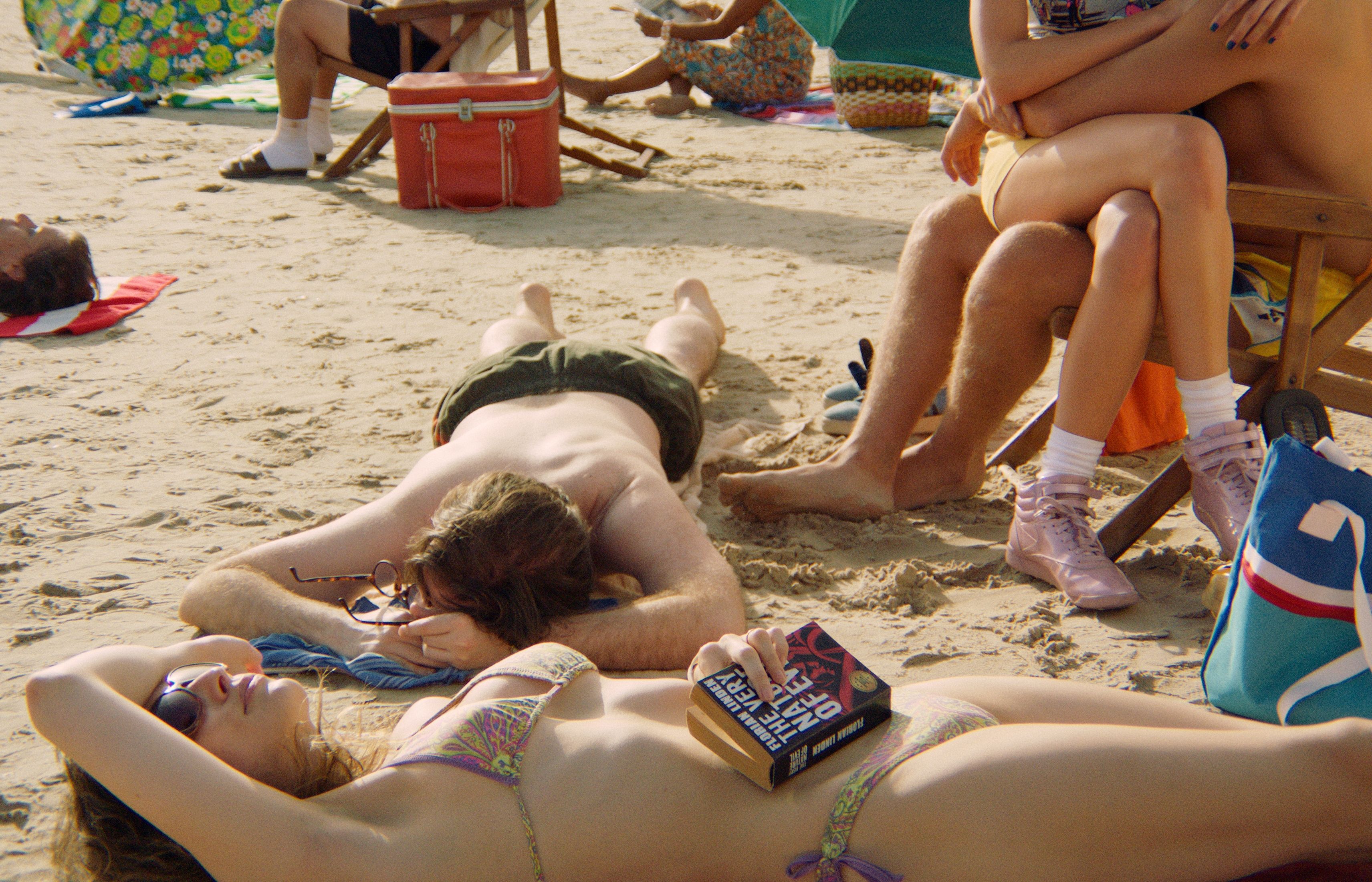
Lola and Charlie disappear off frame
The WWII aerial footage was very unusual. We don’t normally see that period in color.
TW: Alicia was fascinated by some color footage from WWII that she found in her research. I’m currently doing my master’s in Film Preservation, and through this program I discovered the kind of color technique they used. It was not the three-layer negative that we use today. It was Dufaycolor, an early additive color motion picture and photographic process that captured full-color images using a microscopic geometric screen of red, green, and blue lines printed directly onto the film base. So there's a bunch of colors that are not very well described, colors vibrate when objects move, and sometimes if you have something that was originally blue, it might look a bit more greenish for example.
Of course, most of the footage from the Second World War is in black and white. But Alicia wanted to have the whole film in color. So, where possible, we used original color footage, but I did manually tint some of it and there are a couple of shots where we used computer learning models to tint the footage. Alicia feels strongly that the film is also a pop culture object, and color is an important part of that. The essential feeling in this film is on the beach, in the summer, in the late 80s… and the coloring of the war footage is very much related. We wanted to move the footage away from this idea of WWII documentaries, and put it into a fiction object, which is her film.
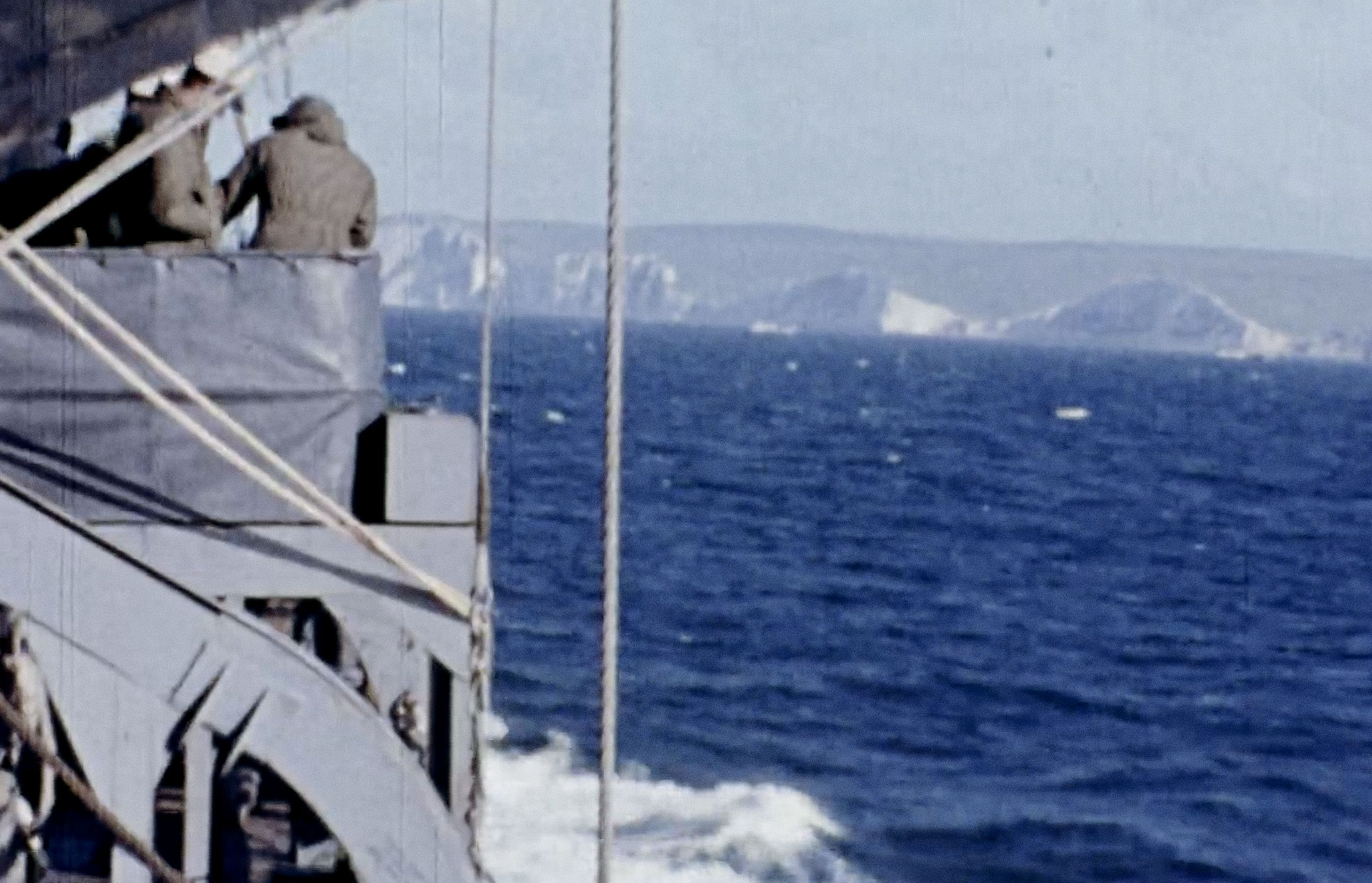
Color scenes from WWII
How was the experience collaborating remotely on the grade?
TW: When we did the color grading, Alicia and I were both living in Chile, and Alejo was living in Madrid. So we worked completely virtually. I had some reviews with Alicia in person, but she's also the director of a TV channel, so she doesn't have a lot of time. So it was mostly Alejo and me working together.
AM: Working with Thomas was a really good experience. He suggested using Louper. The platform became a really important part of the workflow and collaboration process during the color correction. It was honestly one of the smoothest remote grading experiences I’ve had, especially considering the distance and the level of precision we needed for the film.
Louper became a really important part of the workflow and collaboration process during the color correction.
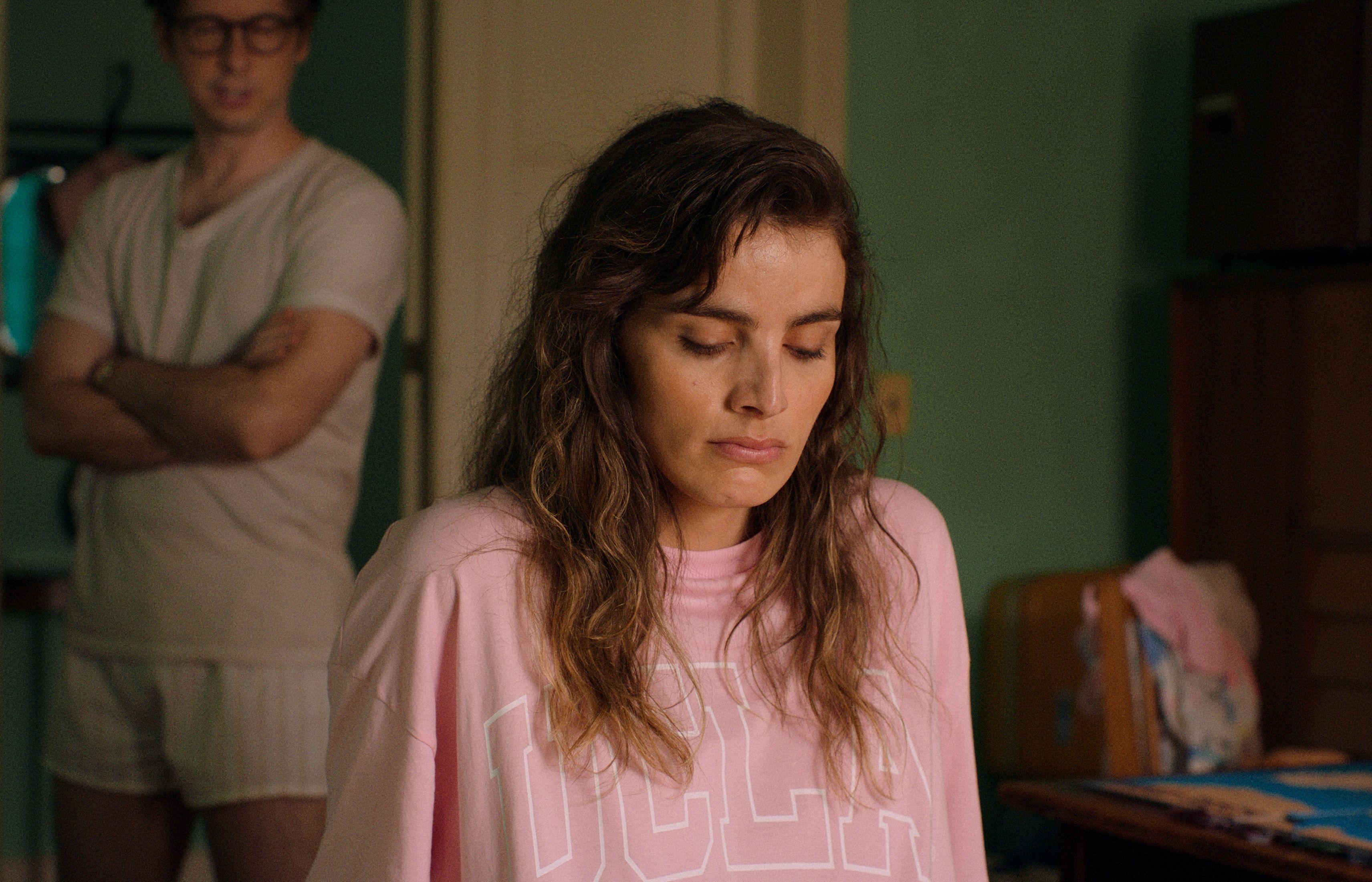
Ingrid and Udo in their hotel Room
As a colorist, how does a platform like Louper change the way you work with your collaborators?
TW: I would always prefer to work side by side with someone, watching the same image on the same screen. But now that I’ve moved to Spain for my master’s, and most of the people I’m collaborating with are in Chile, it's become very important to have a remote solution that works well. What I like about Louper is that you are always connected: when you talk about the image, you can point out a specific part of the frame, it's very practical. It’s allowed me to get more international work: I’ve had work from Argentina, I’ve been offered a film in Poland, so it’s opened up other opportunities.
What I like about Louper is that you are always connected: when you talk about the image, you can point out a specific part of the frame, it's very practical. It’s allowed me to get more international work, and it’s opened up other opportunities.
As a cinematographer, you really need to trust your colorist and have a shorthand to communicate your intention with them.
AM: Yes, in color, everything is so subjective, so personal, and it comes down to taste. People that I work with a lot, they know me, so that is a bit faster. But when I start to work with someone new, it can take a bit of time for us to understand each other. I work a lot with my instinct, sometimes it's hard to translate into words what I am feeling, but I really know my footage and I know how it should look.
I try to light with the contrast in camera. I work closely with the gaffer and the key grip to have the light and the shadows exactly where I want them. For sure, the color tools today give you a lot of freedom to change the image, but I like to keep the mood of the movie the way it was captured.
'Summer War' trailer
AM: When we started the color correction, sometimes Thomas and Alicia saw the footage as really dark, and their first instinct was to add more light. But we talked through the intention, and we worked hard to keep the contrast ratio the way it was shot. We also arranged projections in a cinema theatre here in Madrid, and in Santiago, so we could watch the first color correction, make notes, and then work on the color together again. I had to explain that I wanted it like this. But yes, Thomas understood that very quickly, and he did beautiful work because the finished movie looks better than the footage!
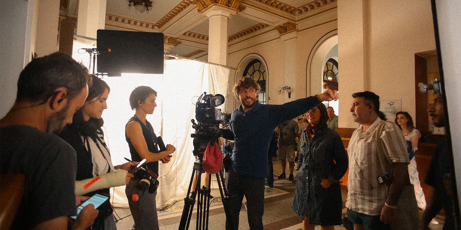
Alejo Maglio and crew on the set of 'Summer War'
Whenever I am on set, looking through the viewfinder, my feeling is always that I am in a seat in the middle of the cinema, watching the big screen in a dark room. That is how I frame, that is how I light. If there is a shadow, or if one side of the face is really dark, it's because it's meant to be like that. I say you have to be a friend of the shadows. Don't be afraid of the dark!
You have to be a friend of the shadows. Don't be afraid of the dark!
Alejo Maglio is a cinematographer, originally from Buenos Aires, now based in Madrid. You can check out his narrative and documentary showreels on his site.
Thomas Woodroffe is a director, writer and colorist originally from Santiago. He is currently in Spain, studying his master's in Film Preservation, while working remotely with collaborators around the world. See some of his recent work here.
Summer War Credits Writer and Director: Alicia Scherson. Cinematographer: Alejo Maglio. Production Design: Sebastián Muñoz. Editor: Manuel Ferrari. Sound: Romina Cano, Guido Deniro. Colorist: Thomas Woodroffe. Producers: Isabel Orellana Guarello, Juan José López, Pedro Barcia, Nicolás Grosso.
Summer War Cast Dan Beirne, Lux Pascal, David Gaete, Aline Kuppenheim, Agustín Pardella, Malena Sánchez, Gabriel Cañas, Camilo Arancibia.
All film stills and trailer from Summer War . Behind-the-scenes photograph from set by Andrés Larraín.

Use Louper to stream and collaborate on live shoots, edit sessions, vfx reviews and more - securely and in seriously high quality.

